School'sOut is an efficient, clear dismissal application created to manage elementary school dismissal processes.
The Problem at Hand
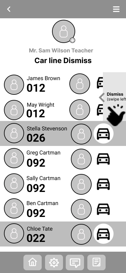
School carpool lines are chaotic, dangerous and inefficient. School staff are inconsistent in daily procedures to meet the needs of parents and staff. Dismissal lines are a safety concern and disrupt traffic. Staff walk between vehicles communicating with walkie talkies and notepads. Parents/guardians display handwritten signs with multiple student names on the windshield. Security measures of authorized pickup identities are falling short. Phone calls to the school administration cause communication breakdowns between staff and students.
As a parent sitting in a carline day in and day out, this problem was staring me directly in the face.
How can Baltimore County Public Elementary Schools efficiently, safely and securely manage student dismissal?
As a parent sitting in a carline day in and day out, this problem was staring me directly in the face.
How can Baltimore County Public Elementary Schools efficiently, safely and securely manage student dismissal?
Key Issues to Address
Dismissals are dangerous and not secure
Buses are unreliable and are a safety concern
Proof of identification is not enforced for pickup of students
Procedures in dismissal are inconsistent
Dismissals disrupt traffic
Communication is broken
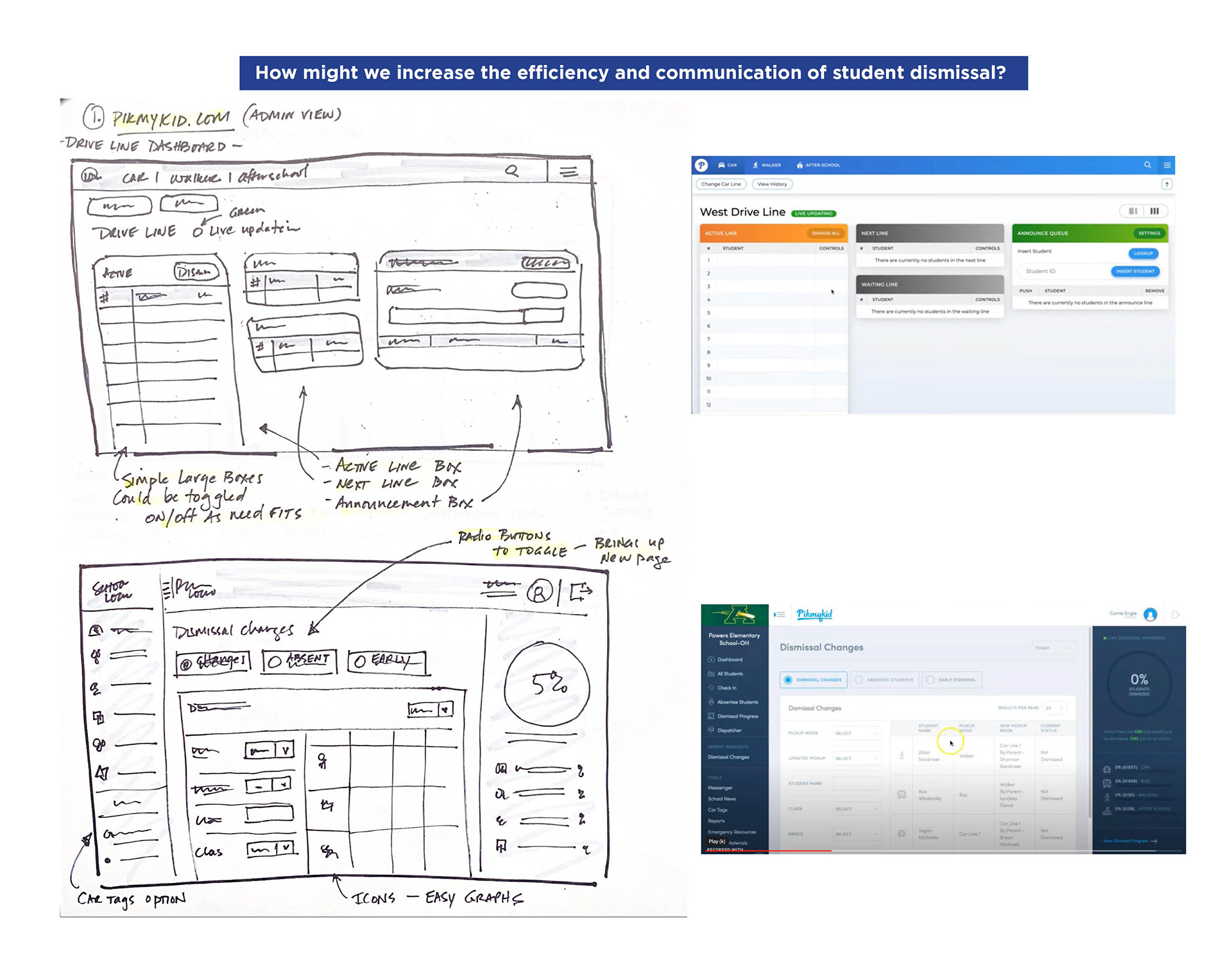
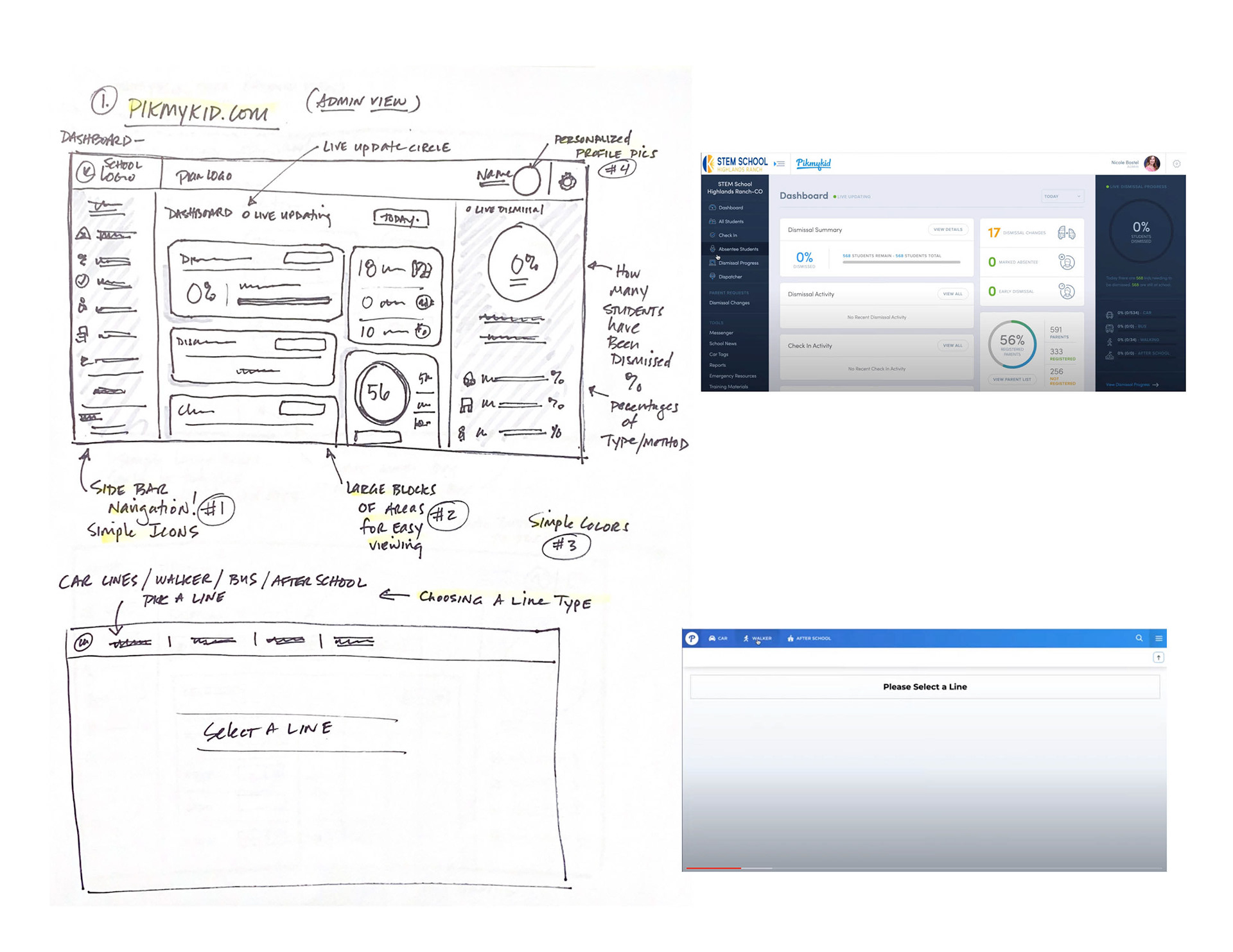
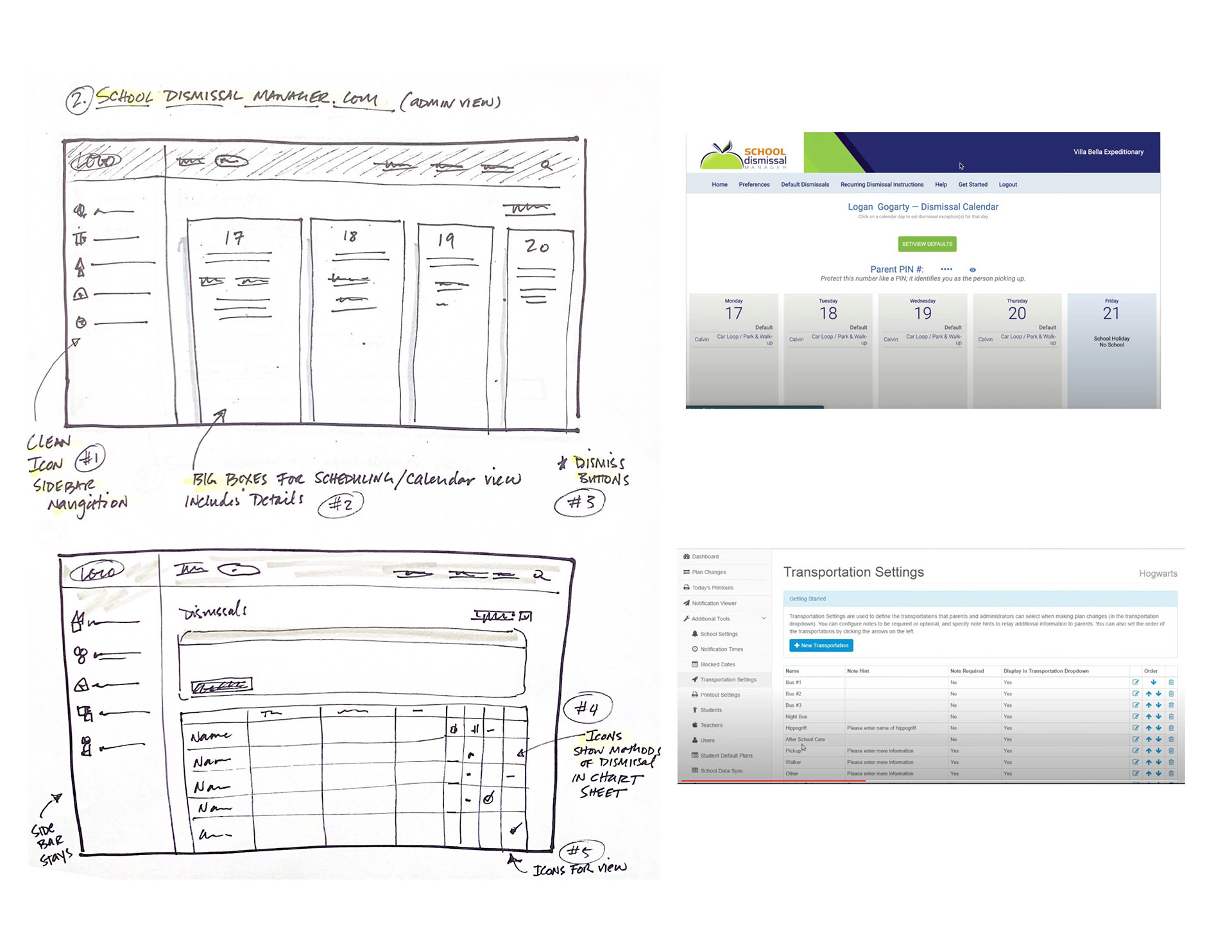
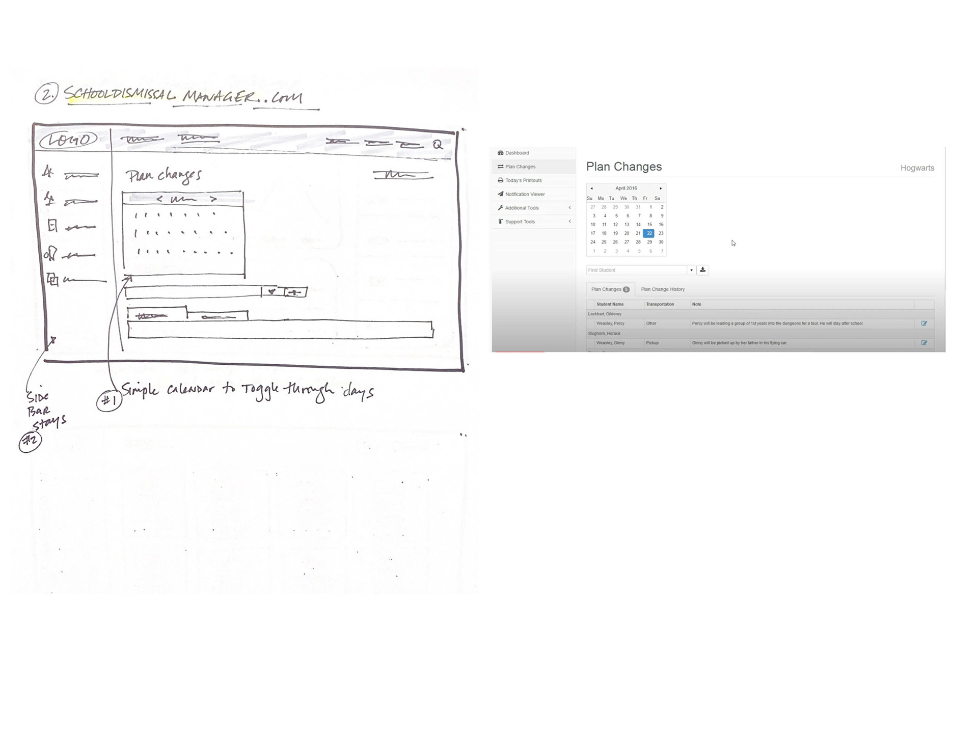
Research
Research began with an extensive competitive analysis matrix. I was incredibly excited and curious what the market looked like. Not long after I dove into the competition I scheduled 4 live online demos for review. The online demos gave me extensive knowledge for a SWOT analysis to determine a baseline for features and improvements.
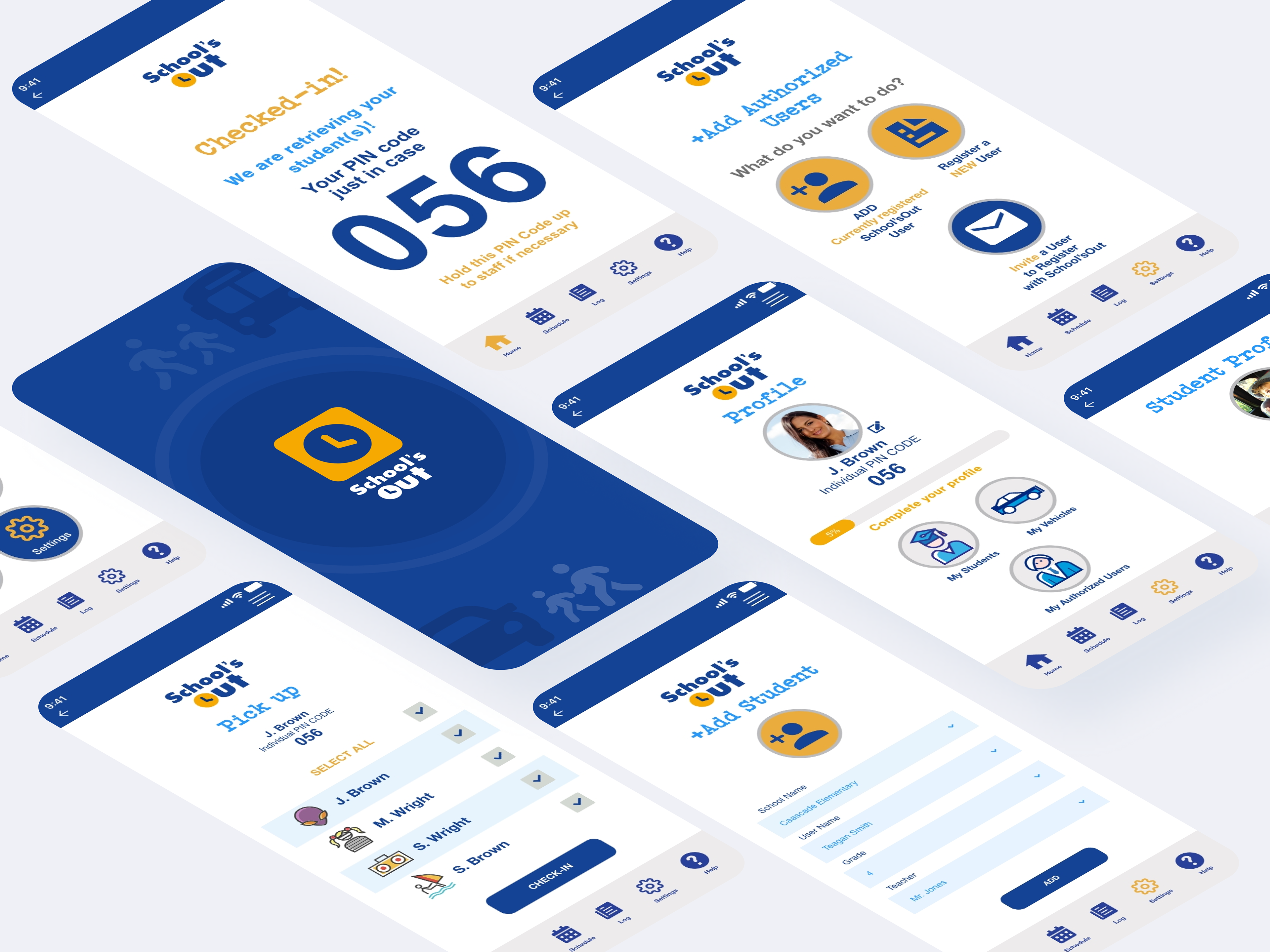
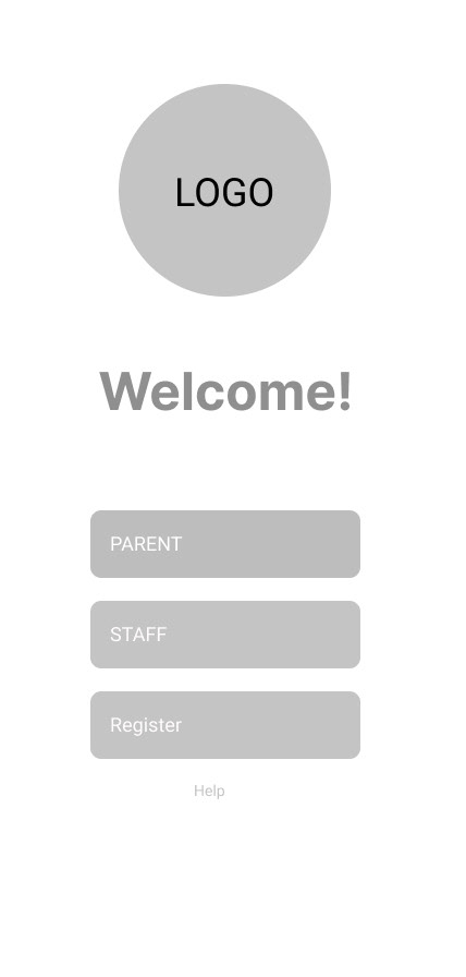
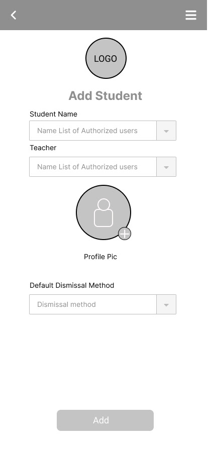
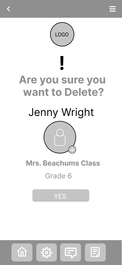
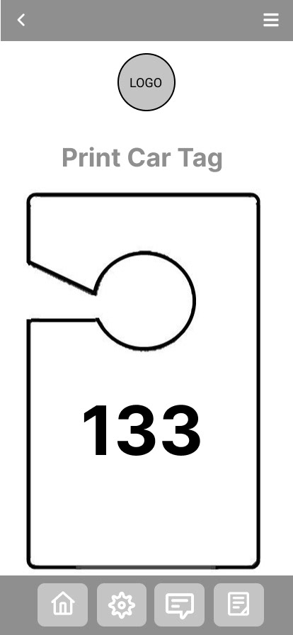
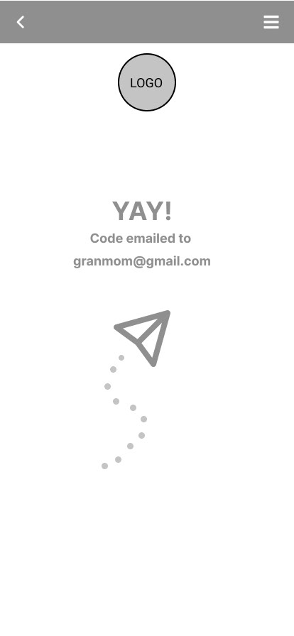
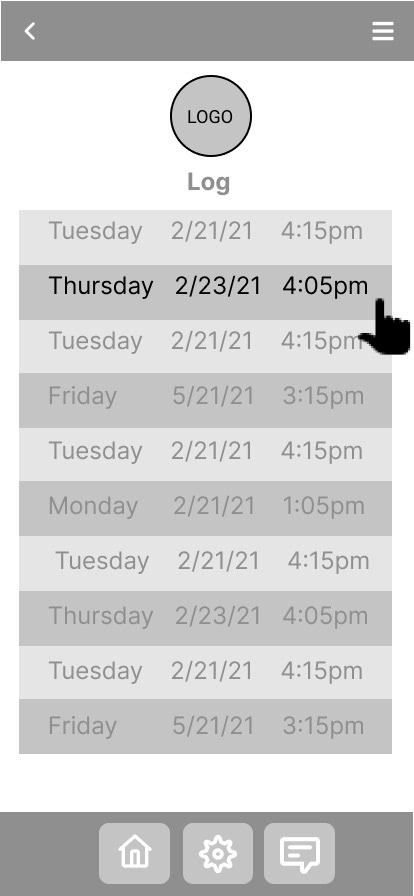
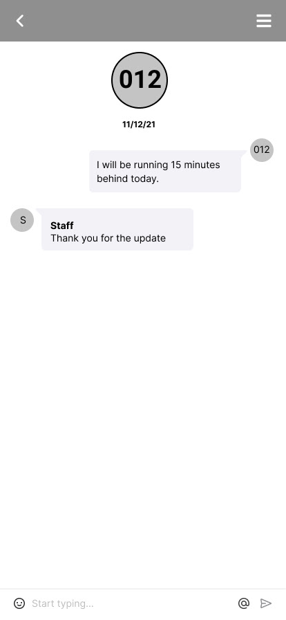
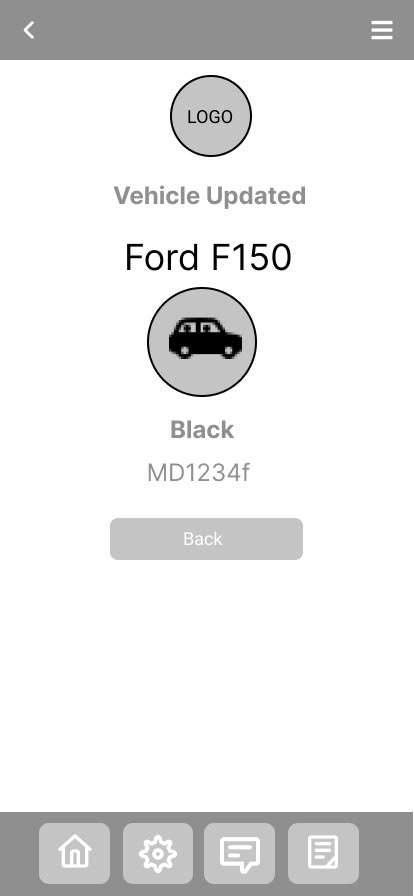
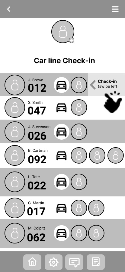
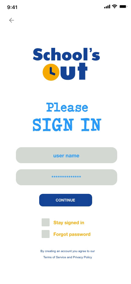
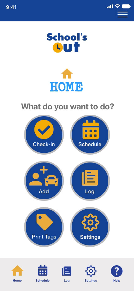
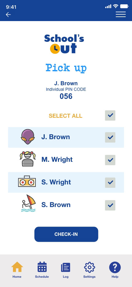
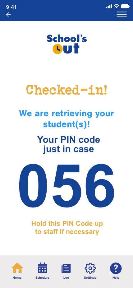
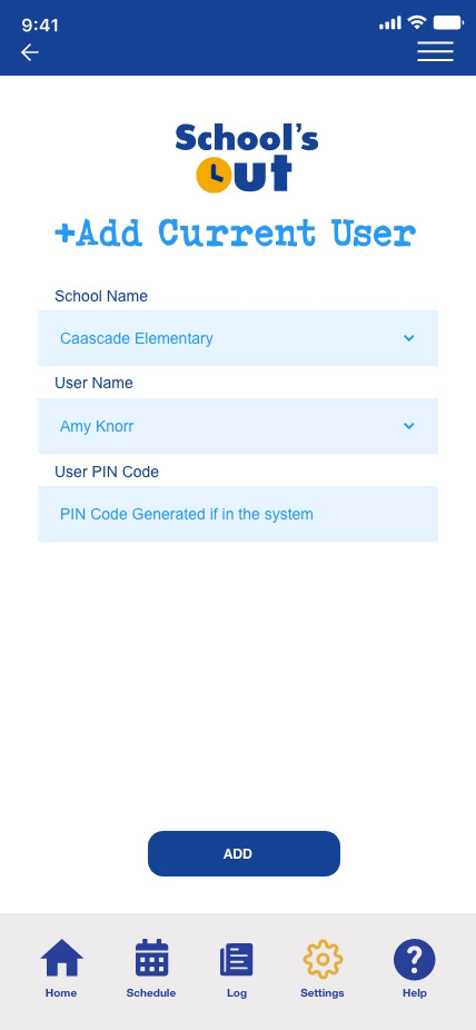
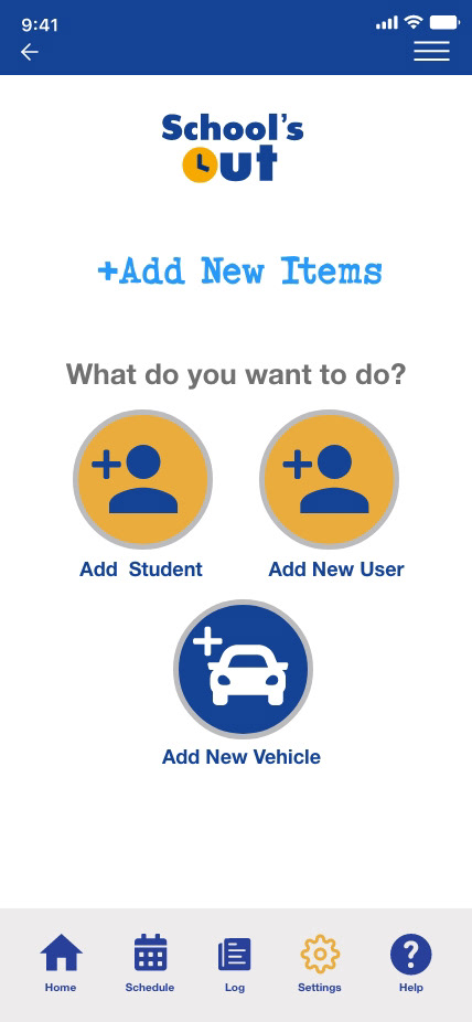
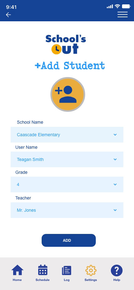
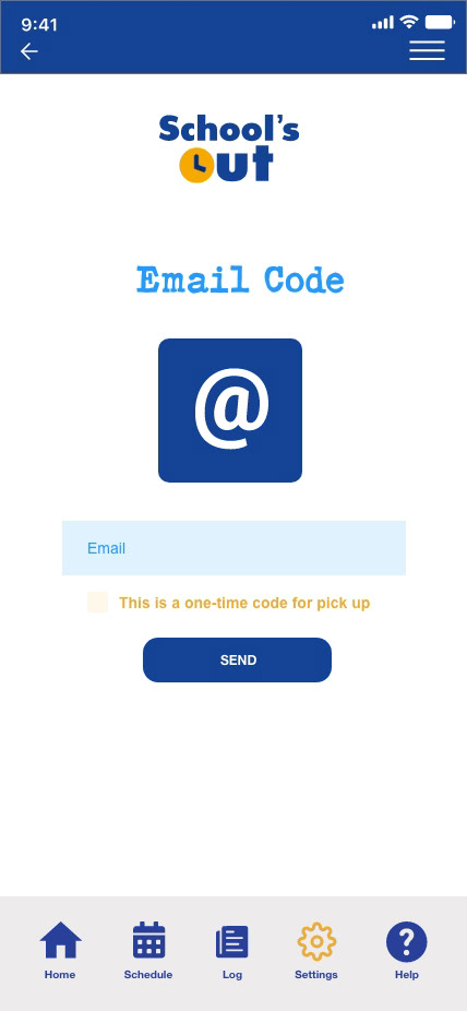
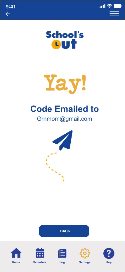
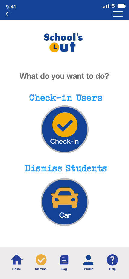
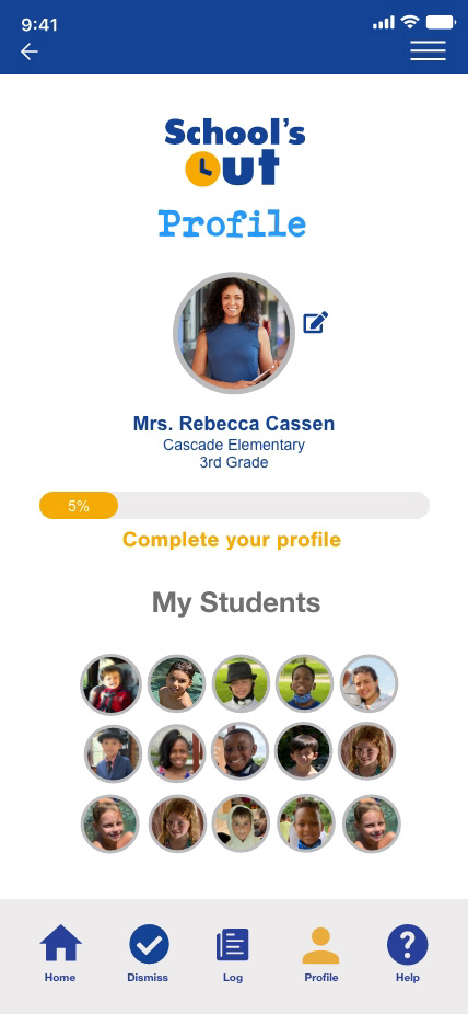
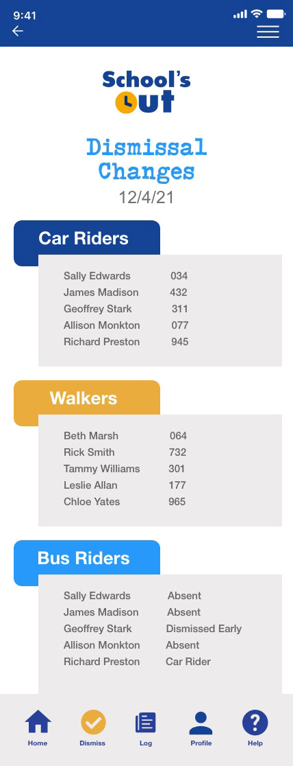
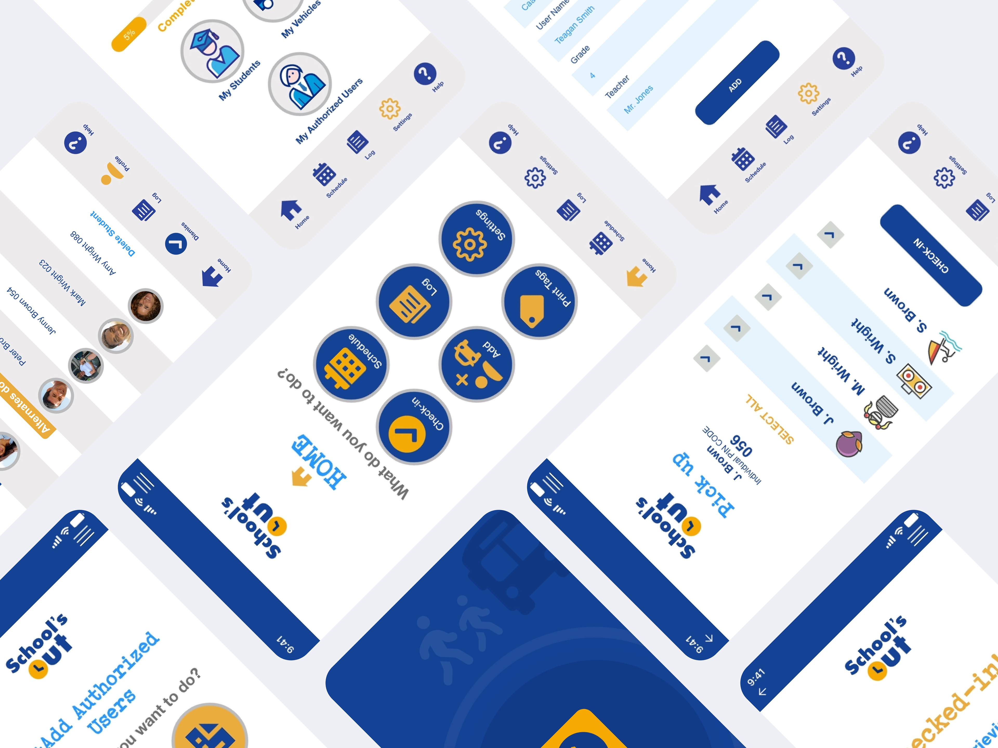
A walk through demonstrating the high fidelity prototype.
Interviews & Mental Models
It was fairly simple to see who the main users were in a carpool. The parents of students retrieving and the school staff dismissing. Once this was established, a screener was distributed online through social media and personally by foot within school dismissal carpool lanes. I did not have any issues finding participants who had an opinion in the matter.
7 participants were selected and interviews lasted around 1 hour. Participants had much to say and there was no shortage of stories and emotions regarding school dismissals. 3 parent users, 3 school dismissal staff users and 1 principal stakeholder.
In addition, I went on-site to an elementary school to witness the dismissal process from all angles and document additional findings through real time observations. I recorded the process and noted areas that were causing friction with the current process.
Goals & Objectives of Research
Discover major pain points the users have with the dismissal process
Understand the user needs and concerns
Understand the current market and uncover potential improvements
Obtain options to address security ASAP
How Did I Get There?
This project spanned over the course of 16-weeks. The problem of carpool dismissal was researched in a UX Research course and the development of the product continued through a Foundation of UX Design course.
Methods
Competitive research analysis matrix (10 direct/6 indirect competitors)
6 online competitor demos completed for review
User personas for 2 user types
Screener for participants
Interviews (7)
Research analysis
Affinity mapping
Empathy mapping
Debriefing guides
Lo-fi wireframes (Figma)
Sprintboard
Lightning sketches/Crazy 8's
Prototype development (Adobe XD) med-fi
User testing (5)
User testing report
Prototype development (Adobe XD)
Affinity Map
As a traditional artist, I headed directly to a pen and paper to document my findings. A post-it note affinity map option on the wall did the trick. I had no experience with online workflow mapping tools and I needed to to get my findings out in front. Key insights and patterns began to unfold on my wall.
Empathy Map
An empathy map was established for each of the 7 users interviewed. This quantitative data provided human centered details for the senses. In addition 7 debriefing guides were completed to solidify my findings.
Key Insights from Research
After methods to track my patterns and findings, many of my assumptions were validated for the MVP:
Security measures are insufficient
Users had very little confidence for current identification measures
Users are anxious about the dismissal process
Users are comfortable using mobile technology
Buses are unreliable
Parents avoid the using the bus
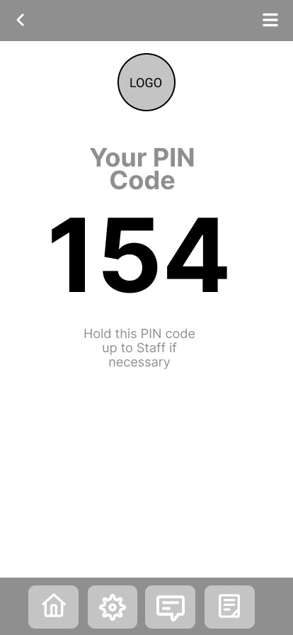
Check-in needs to be quick, efficient and easy to understand
Users do not want location enabled
Personas
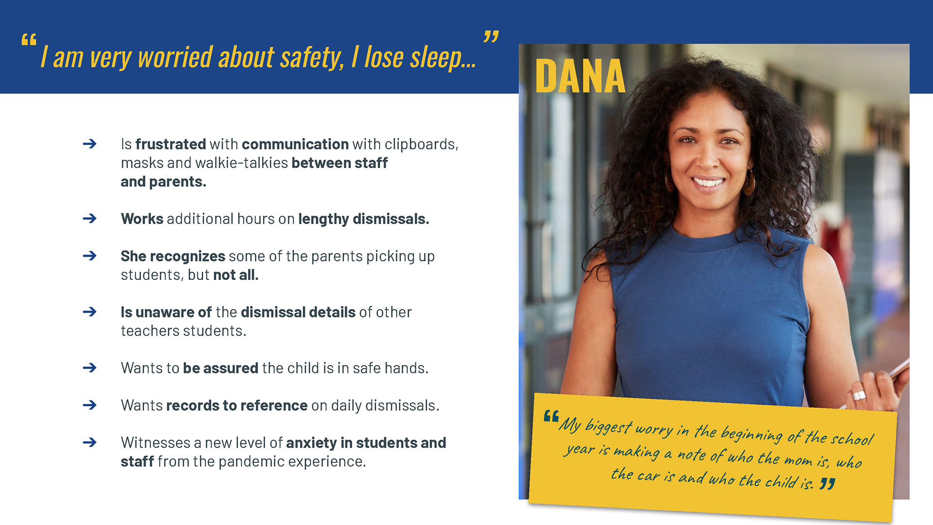
Nervous Nelly - Parent
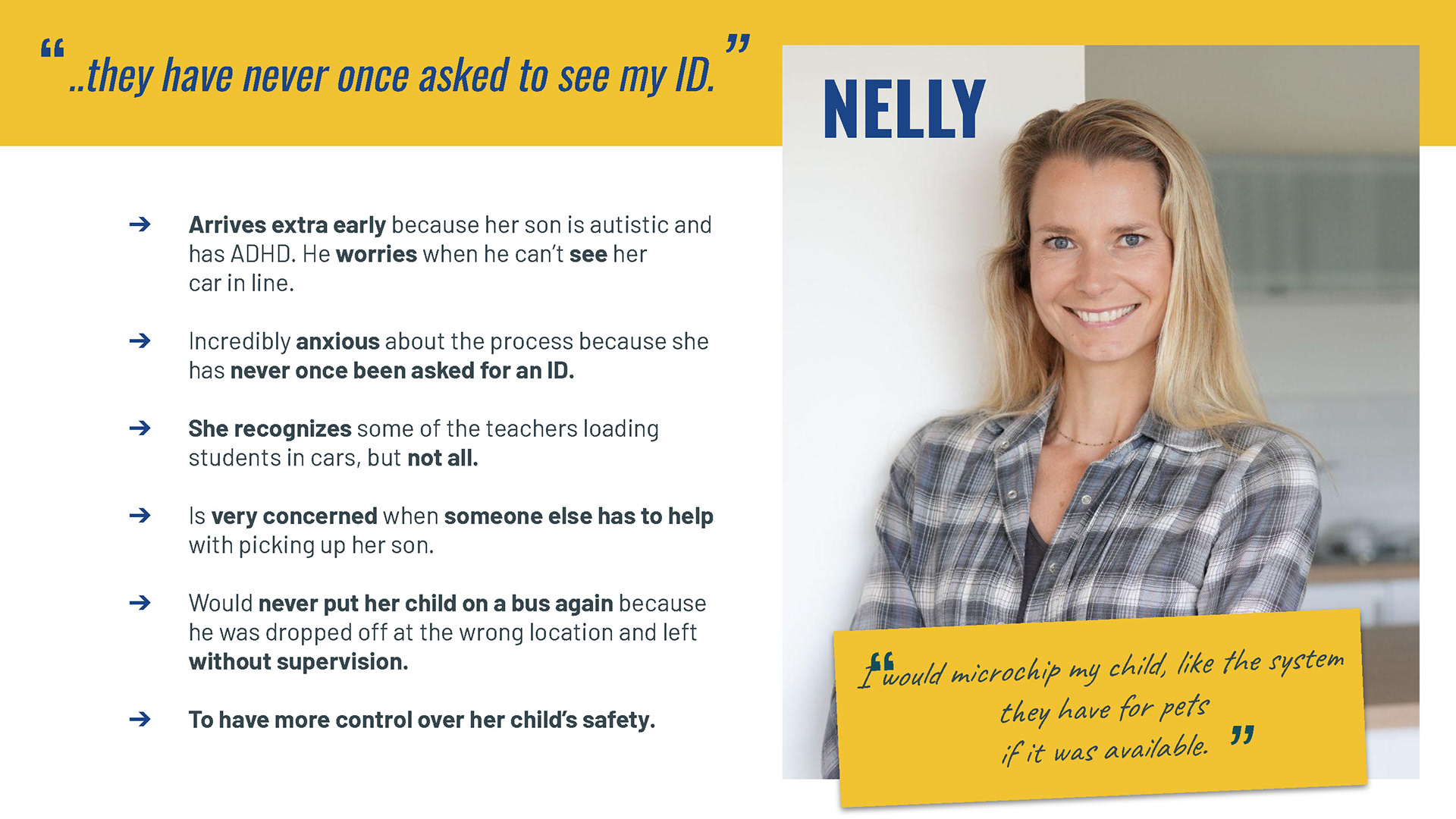
Affinity maps and empathy maps began to build basic frameworks for the two user types for the development of the personas. Repeating concerns and issues were clear and came to the surface to create two engaging personas. These personas provided a thorough perspective of both user types.
Following interviews and data mapping, both user types revealed substantial patterns in emotional, psychological and behavioral needs to incorporate into a solution to the problem statement.
Nervous Nelly and Dispatch Dana provide the goals, fears, frustrations, wants and technology patterns.
Dispatch Dana - Staff
Sprintboard
Development continued to layout potential flows for the structure and framework of the application. "How might we" questions provided clarity on problems to solve within the framework in the user flows and low-fi wireframes.
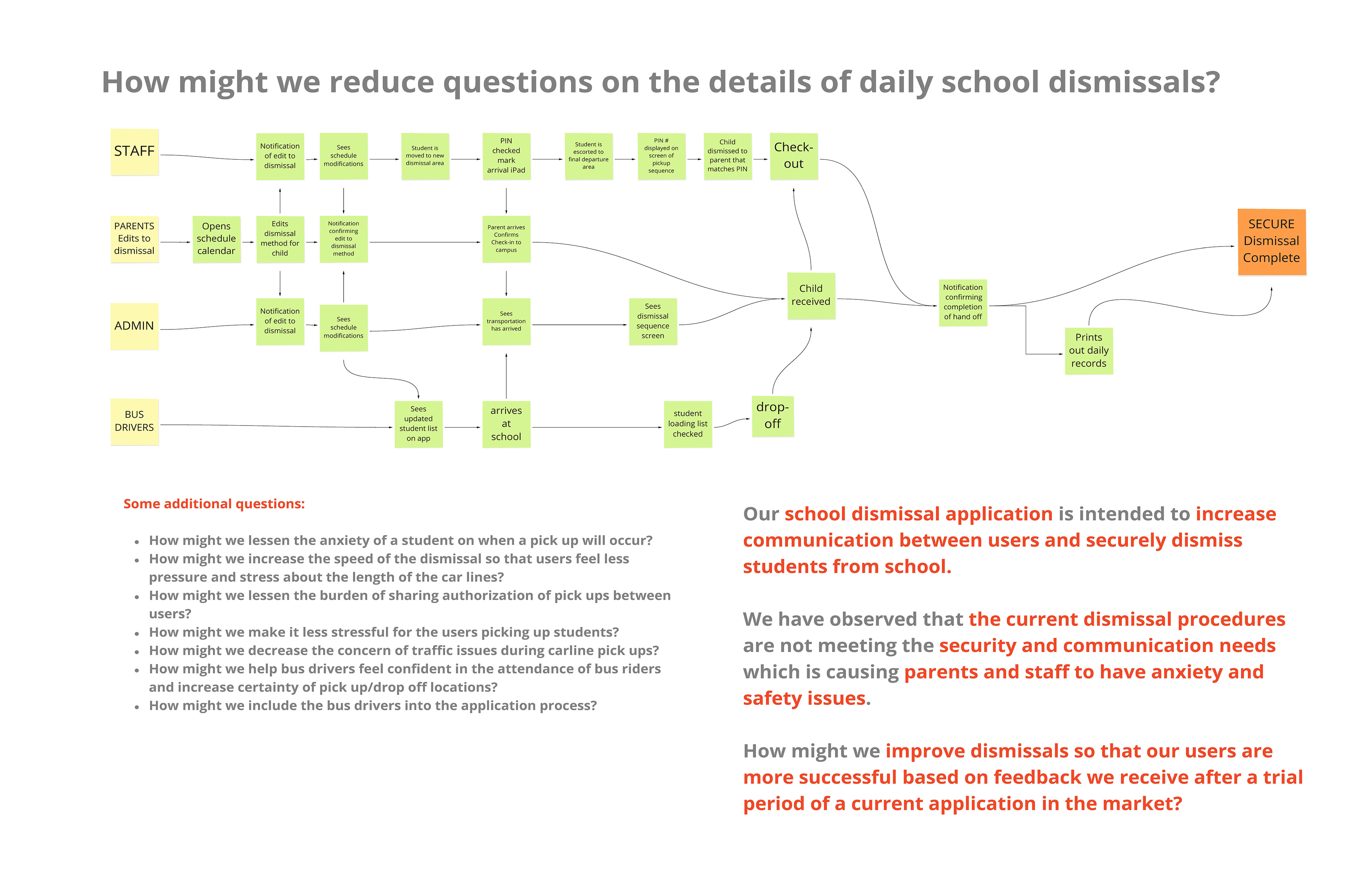
A sprint board helped to unlock the questions and user flows of each user type.
Lightning Sketches & Crazy 8's
Initial concepts tackled a primary user interface for a desktop application. Although this application would eventually need the support of a desktop application, a desktop UI was abandoned due to the 8-week production timeline.
Inspiration for the desktop UI was found in community groups online. This aided in structure and potential information architecture options.
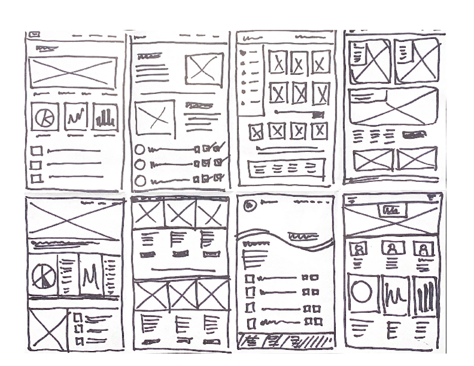
The crazy 8's for a desktop application actually aided in options for the mobile design UI.
Low-fi Wireframes
3 simple tasks users would potentially need to complete were created:
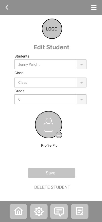
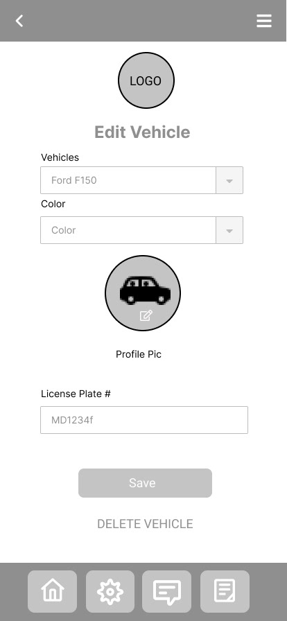
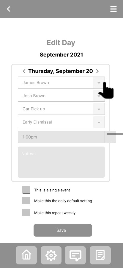
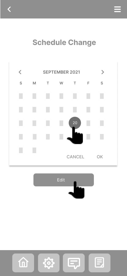
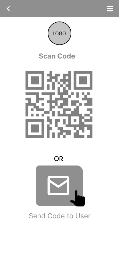
1. A parent wants to check-in and pick up their student
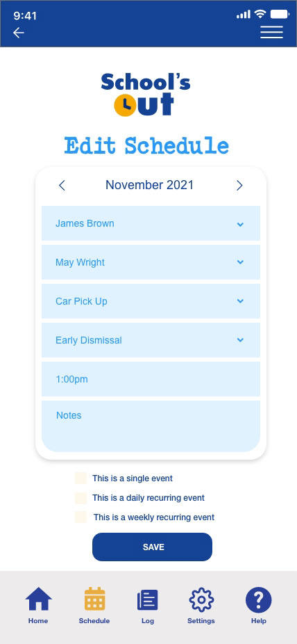
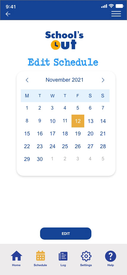
2. A parent needs to edit the calendar
3. A parent needs to share their code with a family member to authorize pick up
The tasks were focused on the parent side of the application because the user flow would be similar on the staff side to duplicate and modify.
This was my first attempt at using a tool for prototyping. Although I have a visual background in design, I was unfamiliar with the vehicle of Figma. Terminology was foreign and when I used keyboard shortcuts in auto-pilot I found myself on a wild ride navigating out of the program.
However, after a brief run, I found a cadence and although I was comfortable enough, I recognized I still had plenty to learn and would easily find room for improvement.

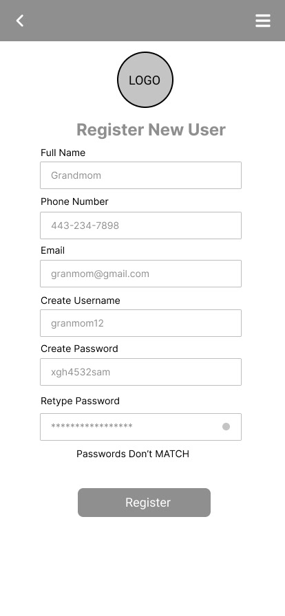


Simple wireframes were initially developed in Figma and then abandoned for a fresh attempt in XD.
Goals
• Reduce stress & anxiety
• Increase security & safety
• Increase communication
• Increase dismissal organization
• Confirm dismissal completion
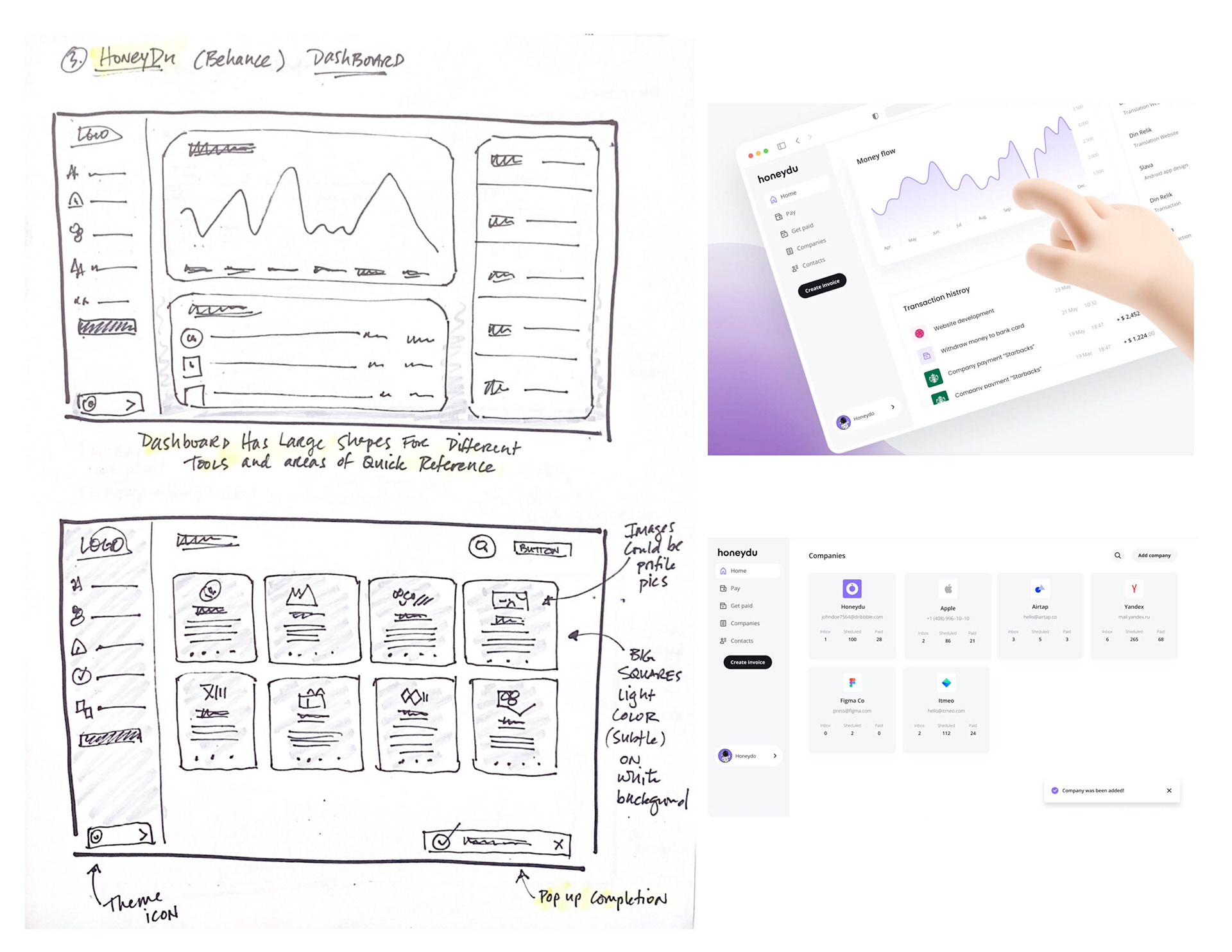
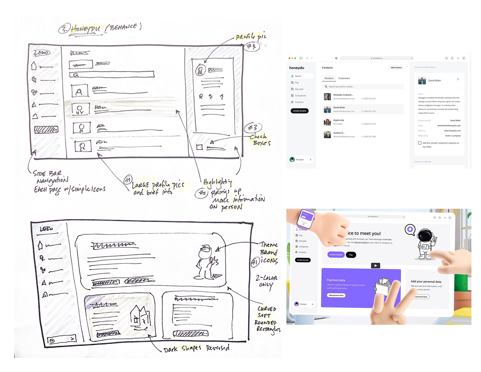
Branding
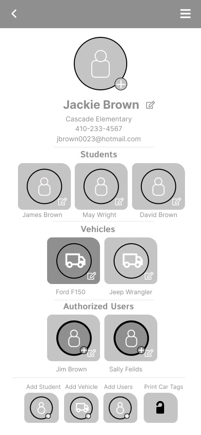
The branding development began with the color palette and the logo. I researched phrases for school dismissal and looked at the competition for key phrases and spelling alternatives. Because the application provided a tool for dismissal as well as retrieval, the name could not be reference one task solely. I elected for a name that reflected the process as a whole over a name that inferred either tasks specifically. I chose a primarily basic color palette that I is traditionally affiliated with elementary schools. I aimed for "elementary" design components and layouts to be as simple, easy to read and navigate as possible.
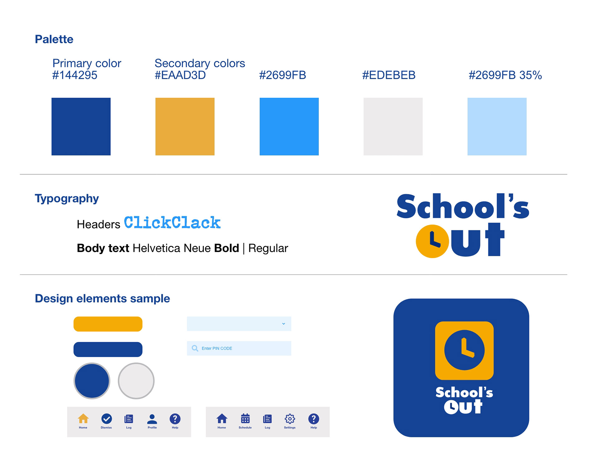
Primary colors that represented school were chosen. The design system was incredibly elementary due to this being the first attempt at creating variables, components and assets.
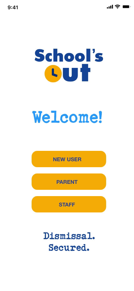
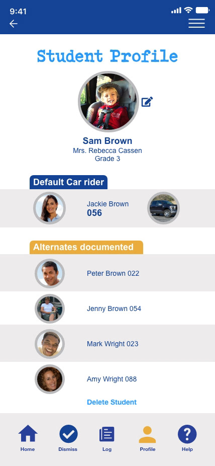
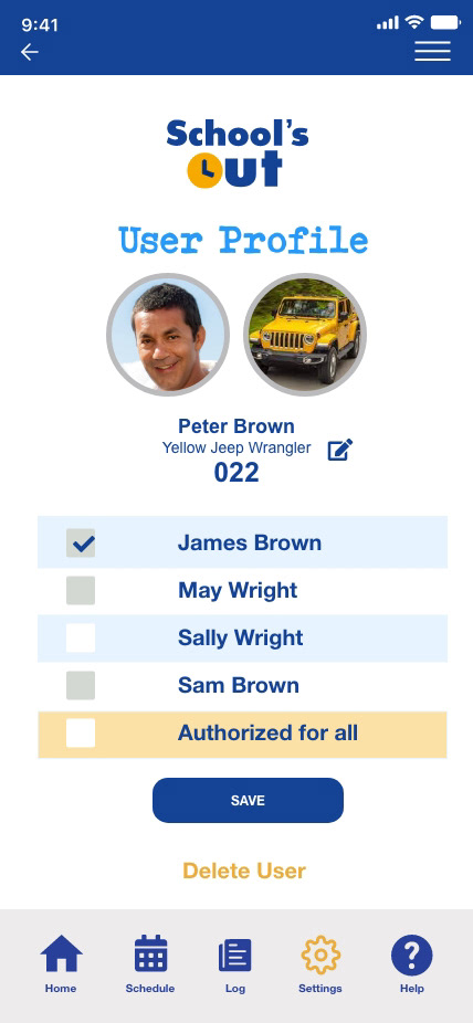
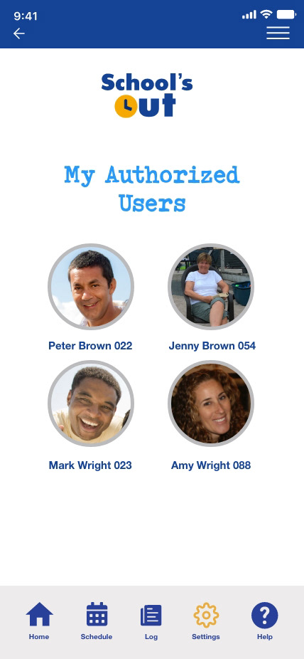
Hi-fi Prototype
School'sOut was my first attempt at prototyping. With a digital and print design background, navigating and learning a new software was a challenge. I began using Figma for low-fi wireframes. I recognized quickly since much of my experience was in Adobe Creative Suite, I was able to quickly find comfort in Adobe XD also. This later changes in my journey as I recognized how easy it was to also get onboard the "Figma train."


Key Takeaways for Iterations
Bottom navigation was adjusted for consistent user flows
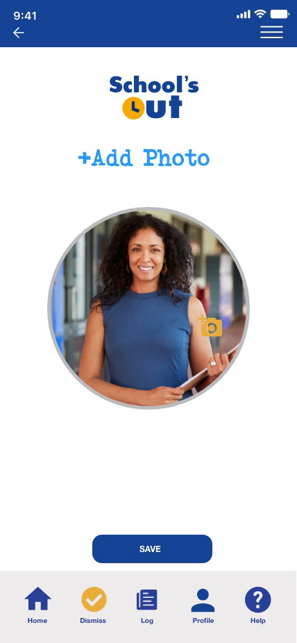
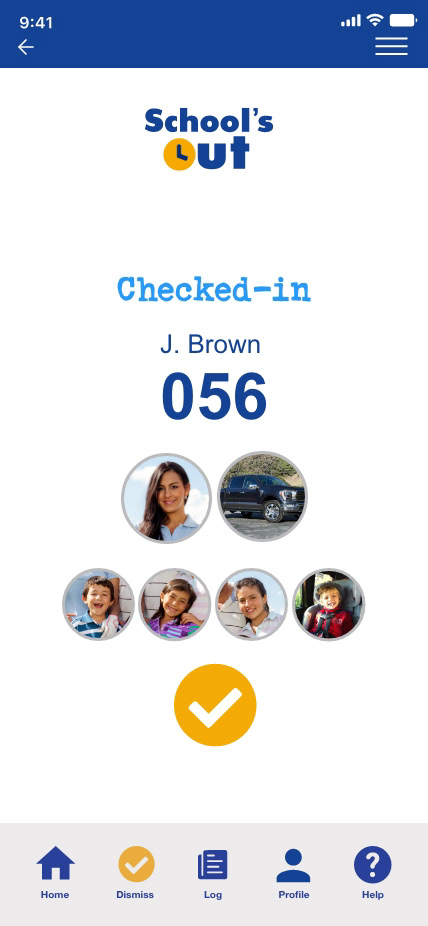
Additional security was provided for parents in photo section for photos or emoticons
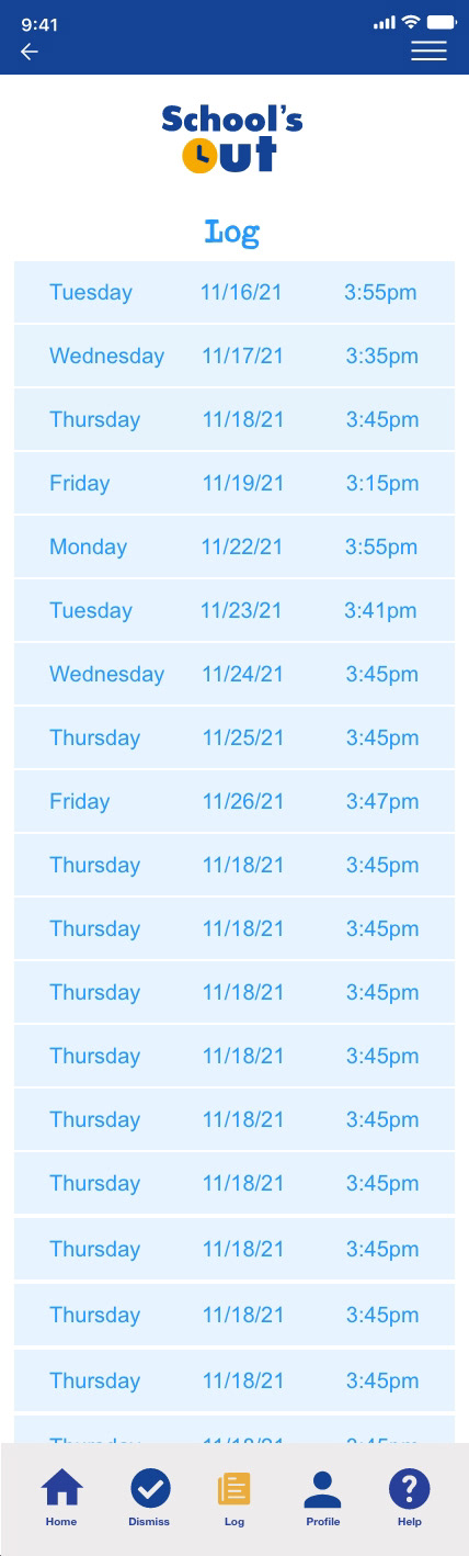
Reduced information for increased security
Colors were adjusted for user accessibility
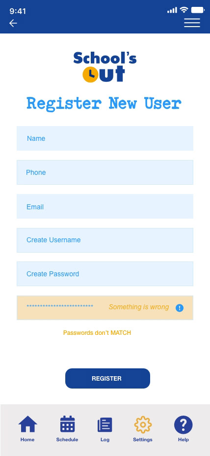
Language was adjusted for clarification on “new users, existing users,” etc
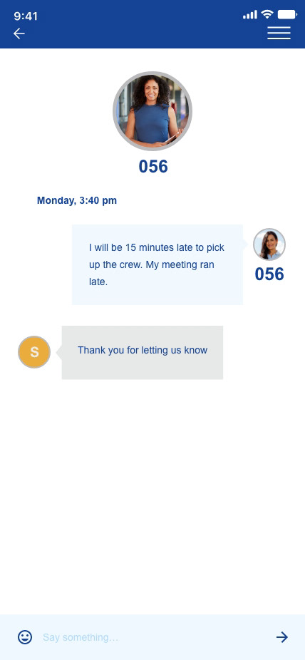
Messaging feature on hold until further research is compiled on interference during dismissal
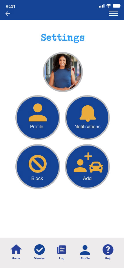
Notifications for scheduling reminders will be added to the settings
My Role and Contribution:
• UI/UX Design
• Research/Strategy
• Branding
• Content
• User Testing
• Presentation
Contribution percentage 100%
• Research/Strategy
• Branding
• Content
• User Testing
• Presentation
Contribution percentage 100%
Lessons Learned
Research is fluid. User research plans, screeners and interview guides are bound to change as research uncovers findings, insights and patterns. Many questions/answers in the initial guides became irrelevant or obvious as trends and desires reoccurred.
Interviews flow easier when they are more organic. Letting an interview loose was when the user became most comfortable. This is when the best insights and stories were provided.
Patterns can shift the focus of the problem statement. As the journey was in the early stages I “assumed” that dismissal efficiency was the most important need. The data revealed that security was actually a bigger concern.
Don’t get bogged down by details. It is easy to spiral into data research. Chasing the white rabbit can take you far away from where you were headed. Keep your eye on your main goal without getting distracted by details that are irrelevant.
Google slides is a poor program to design in. If the design and typesetting needs to be top notch, use another program.
Next Steps
Top 3 dismissal applications suggested to the stakeholder
Participation in trial periods for current programs
Participation in trial periods for current programs
*A proposed prototype concept following the guidelines for a UX Design graduate course. This study was not for profit. Images were used for education draft purposes only.
Like what you see?
Reach out. We have lots to talk about.
Reach out. We have lots to talk about.