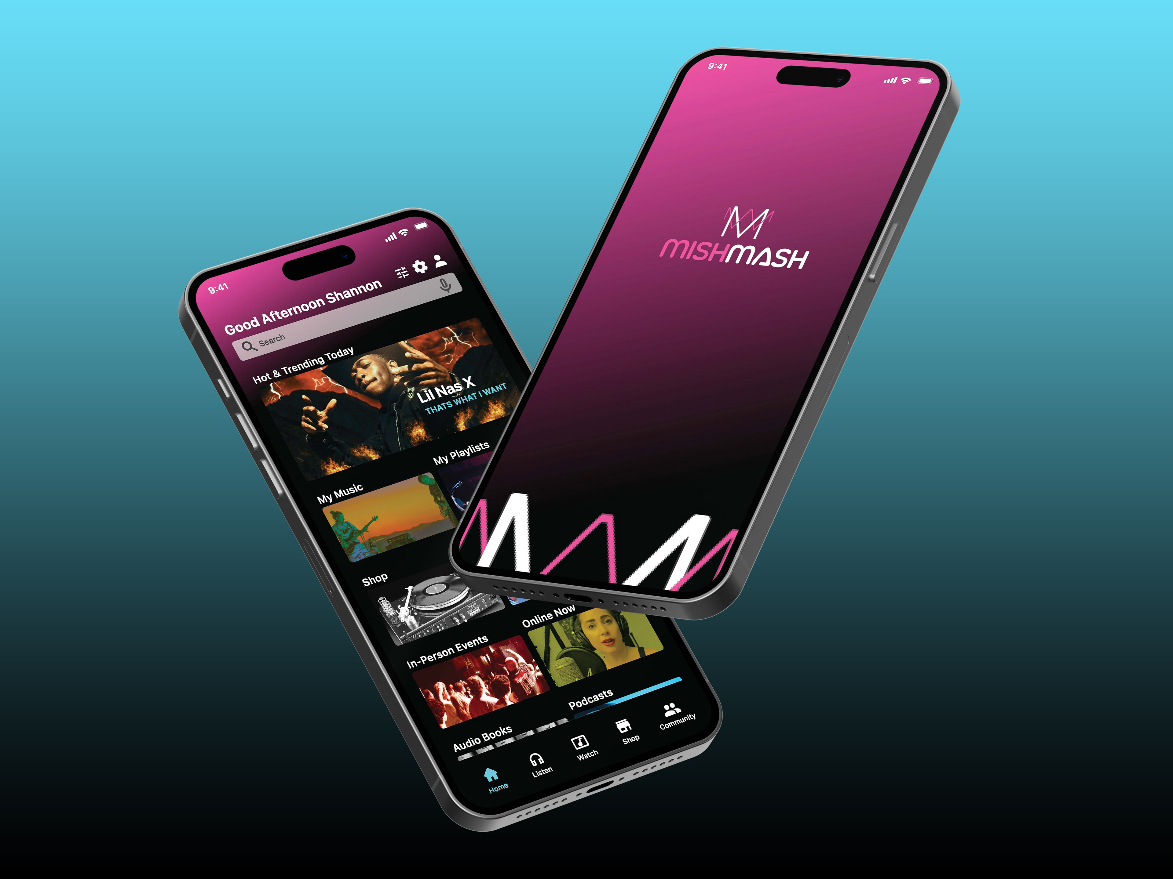
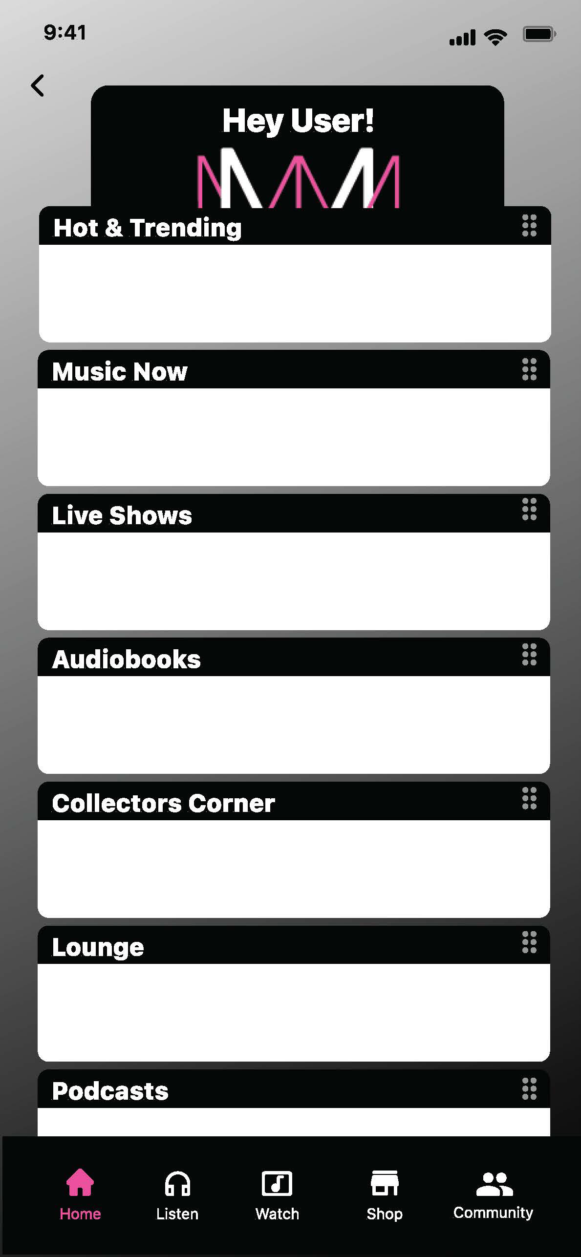
Mishmash is a streaming music application that broadens the utility value by adding the convenience of concert ticket and music merchandise purchasing.
A walk through of the final high fidelity prototype.
Improving a Profitable Product
Music streaming applications are a 13 billion dollar a year industry. With this profit margin, companies have an opportunity to expand their feature base. Users are often navigating away from the application to search for artist tour dates and purchase merchandise. In addition, parents find it frustrating to have limited options filtering out songs with explicit lyrics in playlists.
This project leaned heavily on prototype development. Research did not begin with user interviews to highlight problems. Desk research provided potential pain points to test for product improvements.
This project leaned heavily on prototype development. Research did not begin with user interviews to highlight problems. Desk research provided potential pain points to test for product improvements.
A Focus on Utility
Musician tour schedules, ticket and merchandise purchasing are not features currently available within the leading competitors applications
Searching and shopping consumes a users valuable time
Removing explicit lyrics increases customization
Additional features creates utility value
Searching and shopping consumes a users valuable time
Removing explicit lyrics increases customization
Additional features creates utility value
Research
User research helped to understand the differences in people’s experiences, attitudes and behaviors as they relate to filtering explicit lyrics, merchandise and concert ticket purchasing.
Target audience was adults over the age of 25 with a range of music streaming experience. My focus was on users comfortable with online purchasing of concert tickets, merchandise and parents who felt trapped with a lack of filtering for explicit lyrics.
Target audience was adults over the age of 25 with a range of music streaming experience. My focus was on users comfortable with online purchasing of concert tickets, merchandise and parents who felt trapped with a lack of filtering for explicit lyrics.
Unfolding the Details
• Proto personas
• User stories
• Flowcharts
• Wireframes
• Usability testing (5) low-fi
• Data Research through user testing
• Prototype development
• Usability testing (5) hi-fi
• User stories
• Flowcharts
• Wireframes
• Usability testing (5) low-fi
• Data Research through user testing
• Prototype development
• Usability testing (5) hi-fi
Proto Personas / Flowcharts
Without interviews, quick proto personas were created based on assumptions of current or potential streaming music users. How might current users use streaming applications and what features might they desire? Ideas were brief and provided baseline stories for user flowcharts. 3 proto personas were developed: Justin, Pat and Mary.
Justin
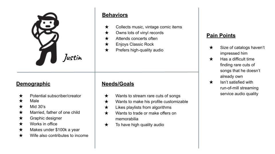
Proto persona for Justin. Justin is interested in reviewing what other music collectors have.
"I want to view what other music collectors have, so I can add unique items to my collection."
- Proto persona Justin
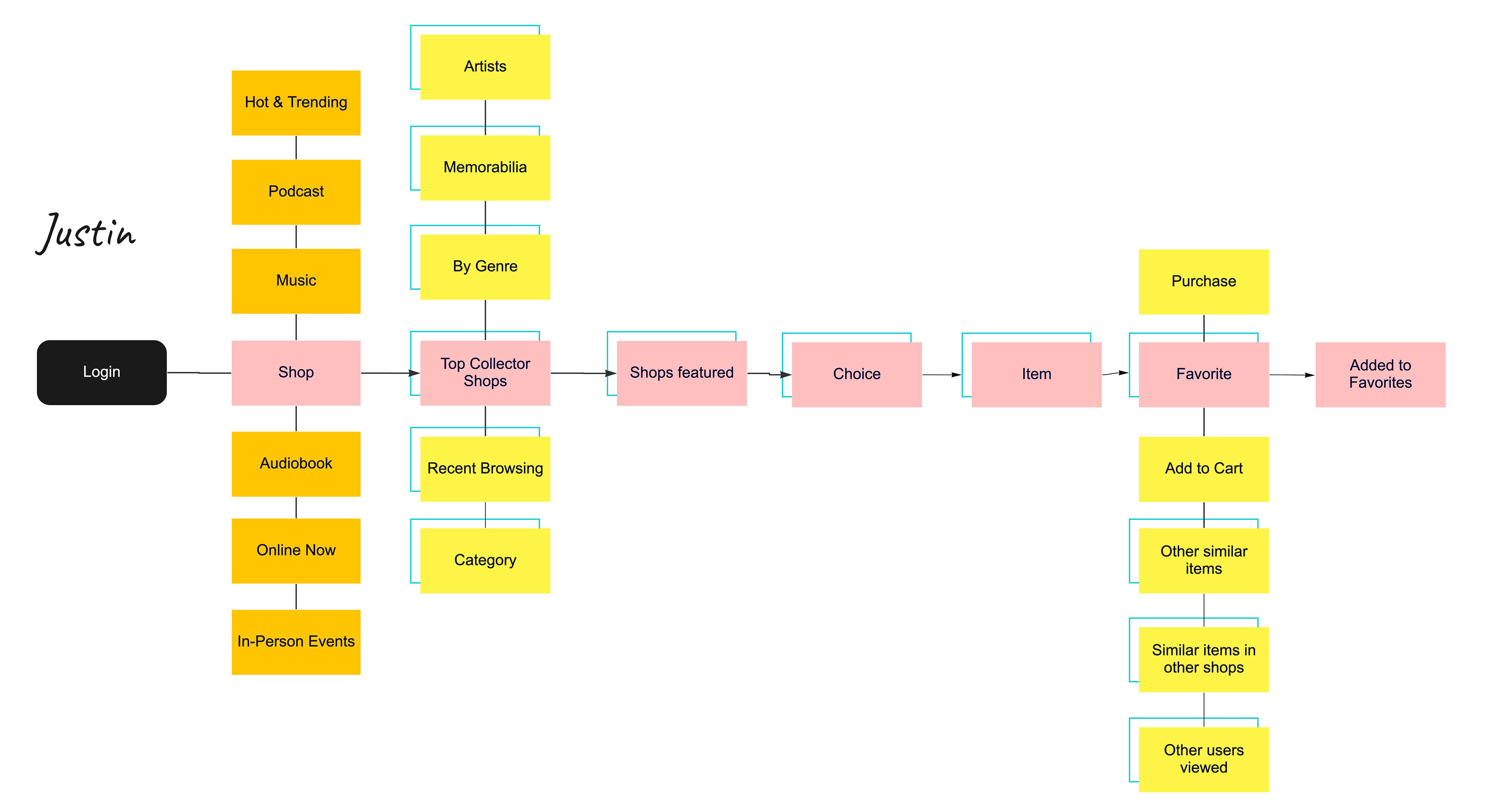
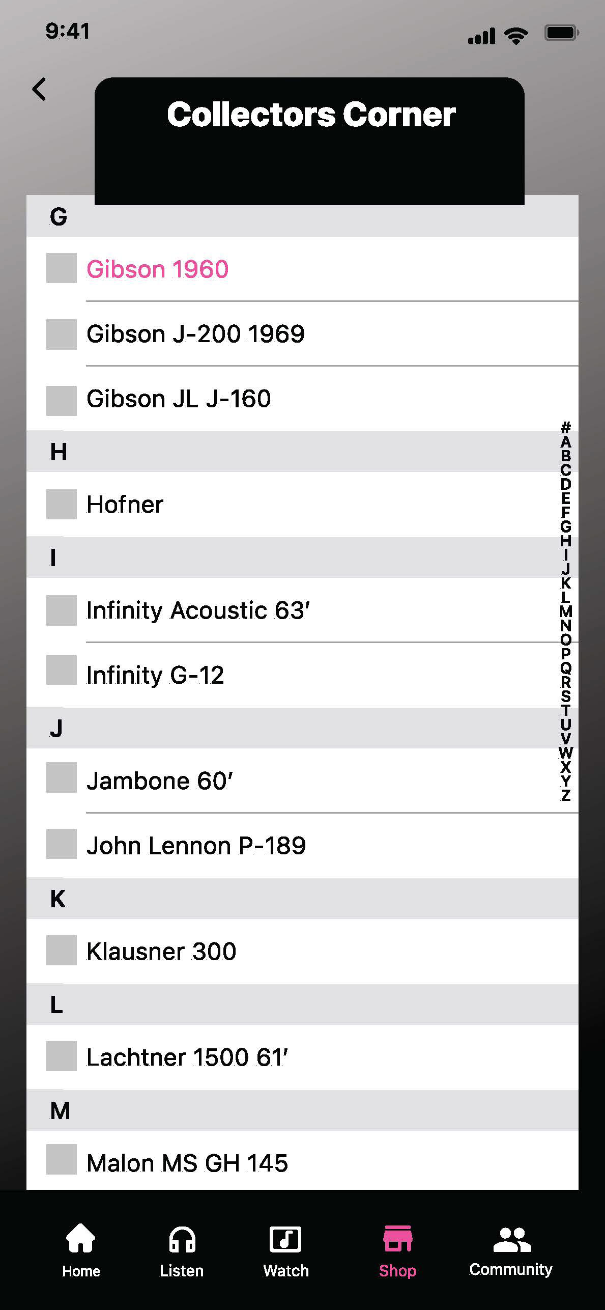
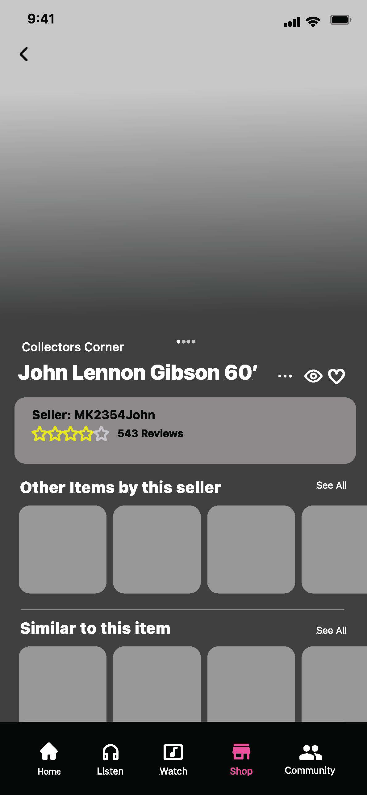
Justin's user flow created in Miro.
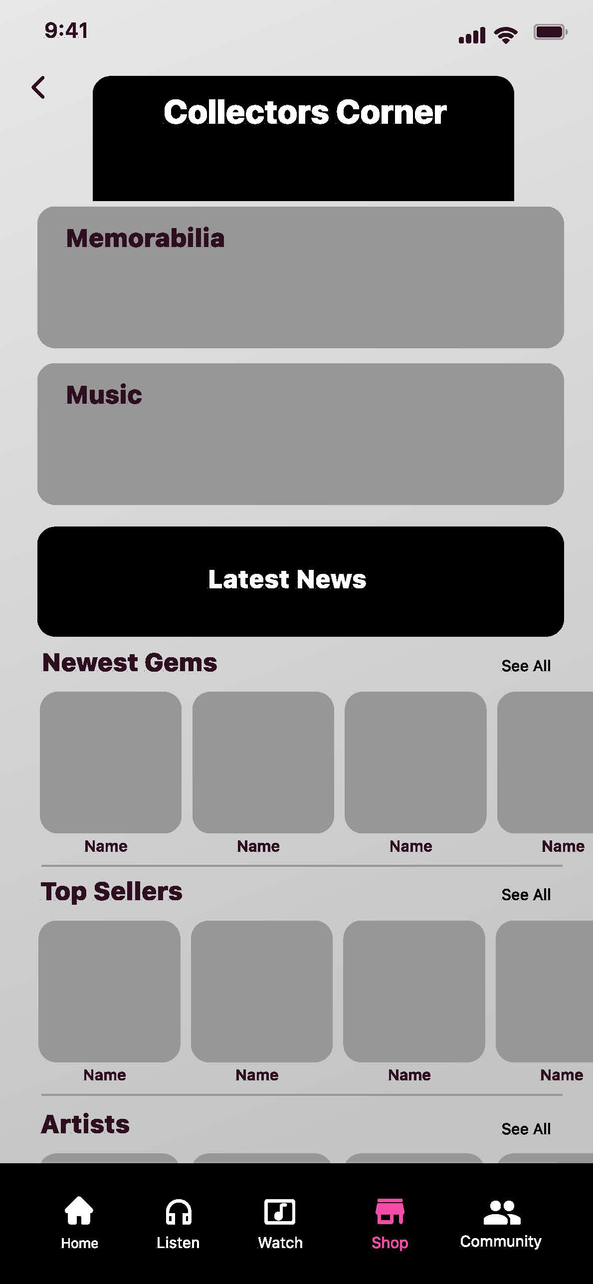
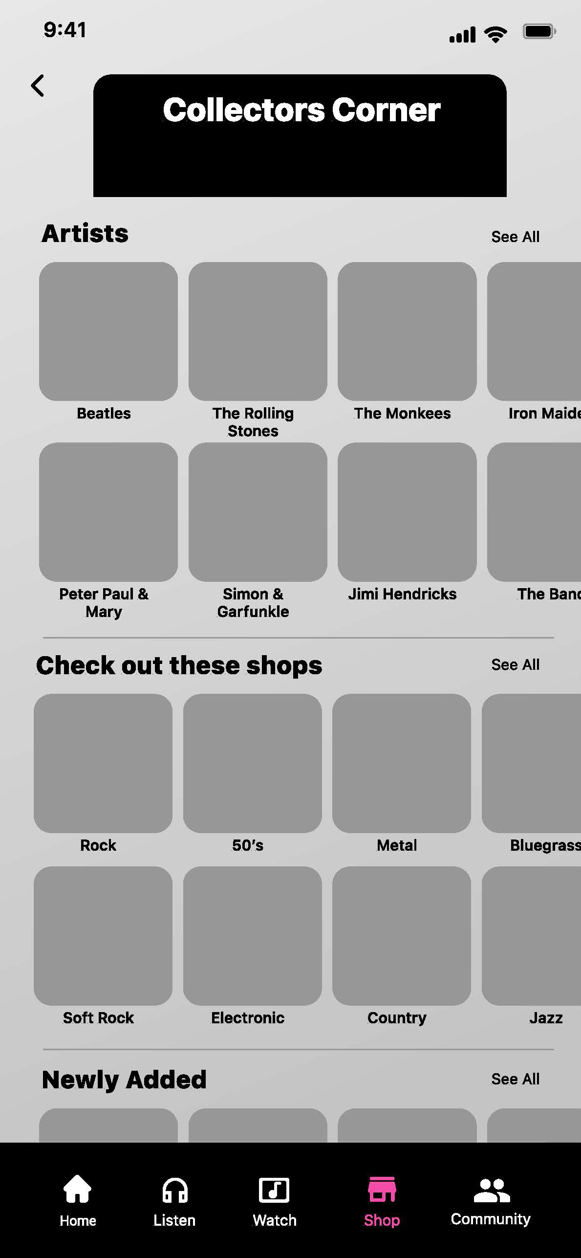
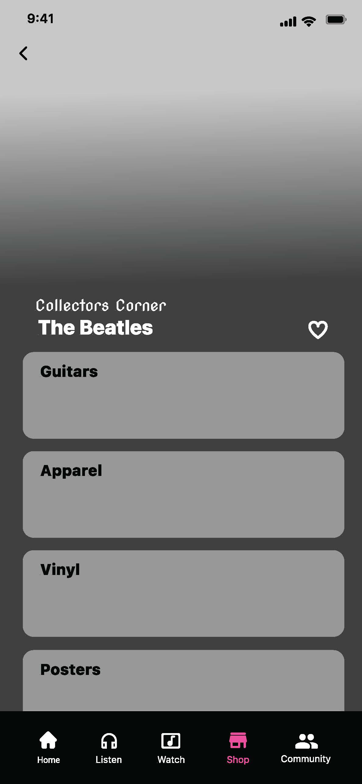
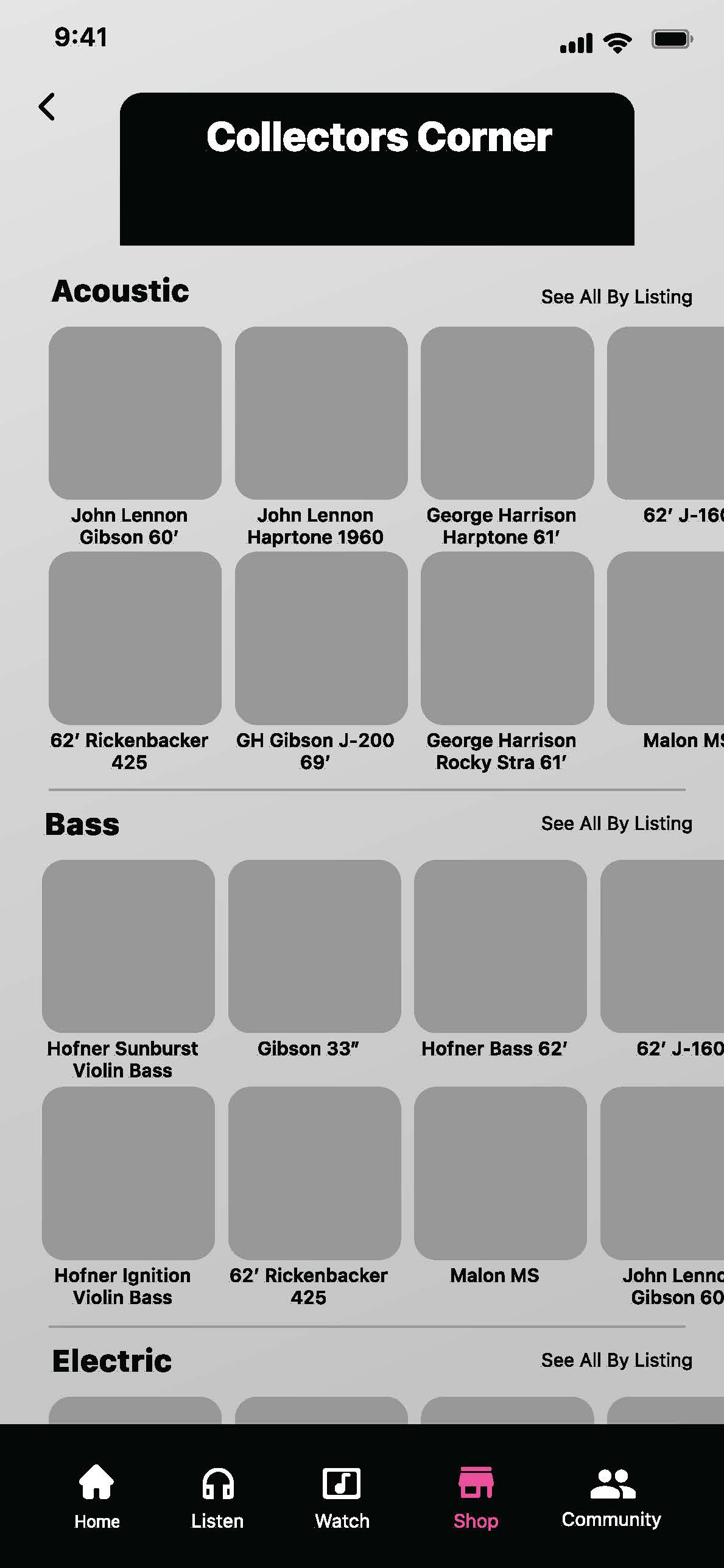
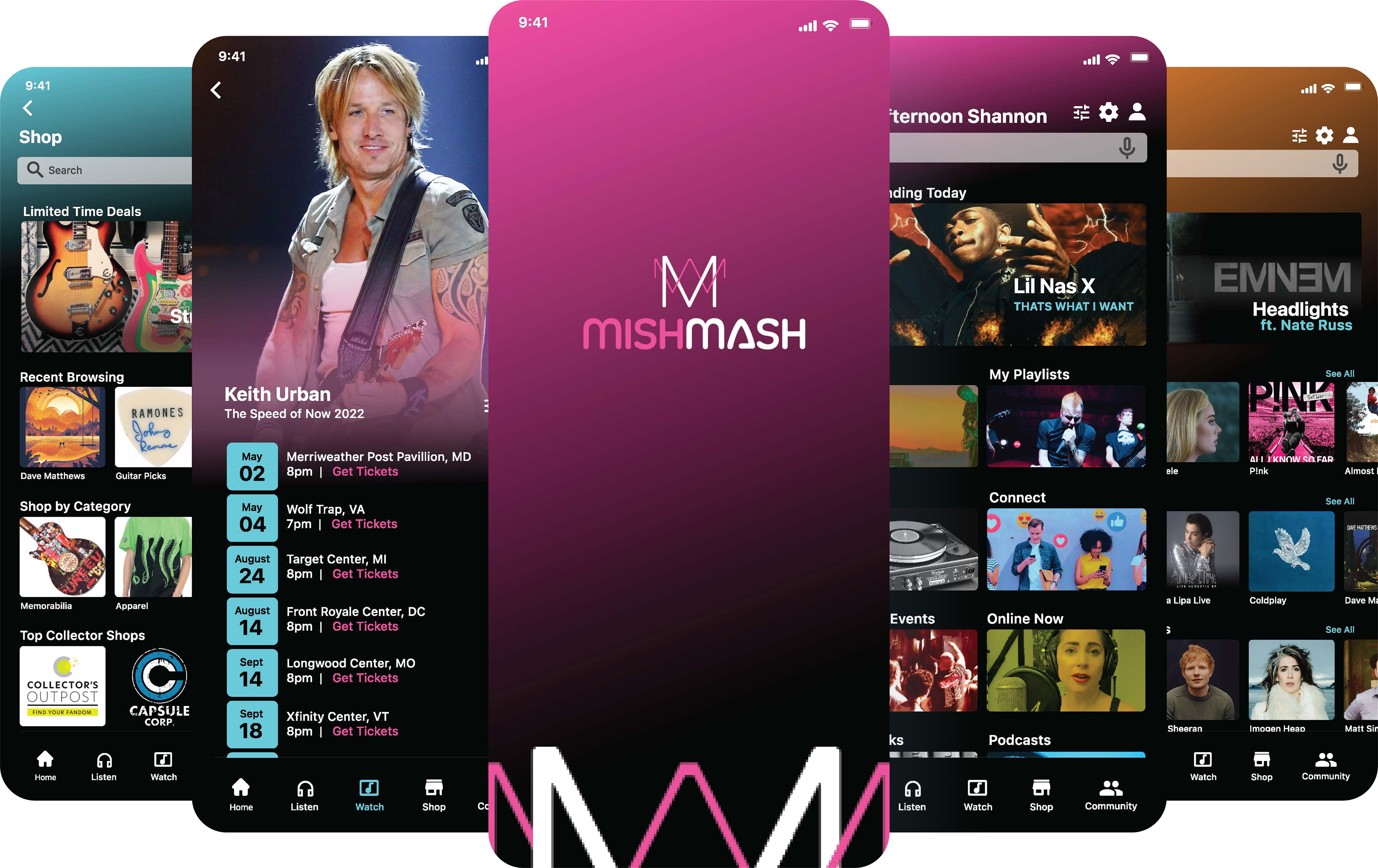
A walk through the memorabilia and commerce section of the application.
Pat
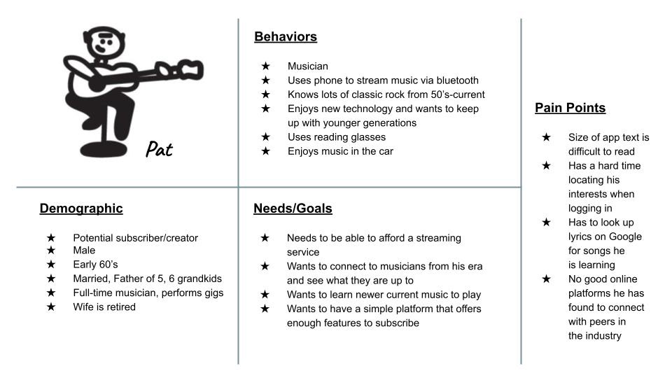
Proto persona for Pat who would like to be able to be aware of tour schedules and purchase tickets easily.
"I want to keep up with artist tour
schedules near my location so that
I can purchase tickets easily."
schedules near my location so that
I can purchase tickets easily."
- Proto persona Pat
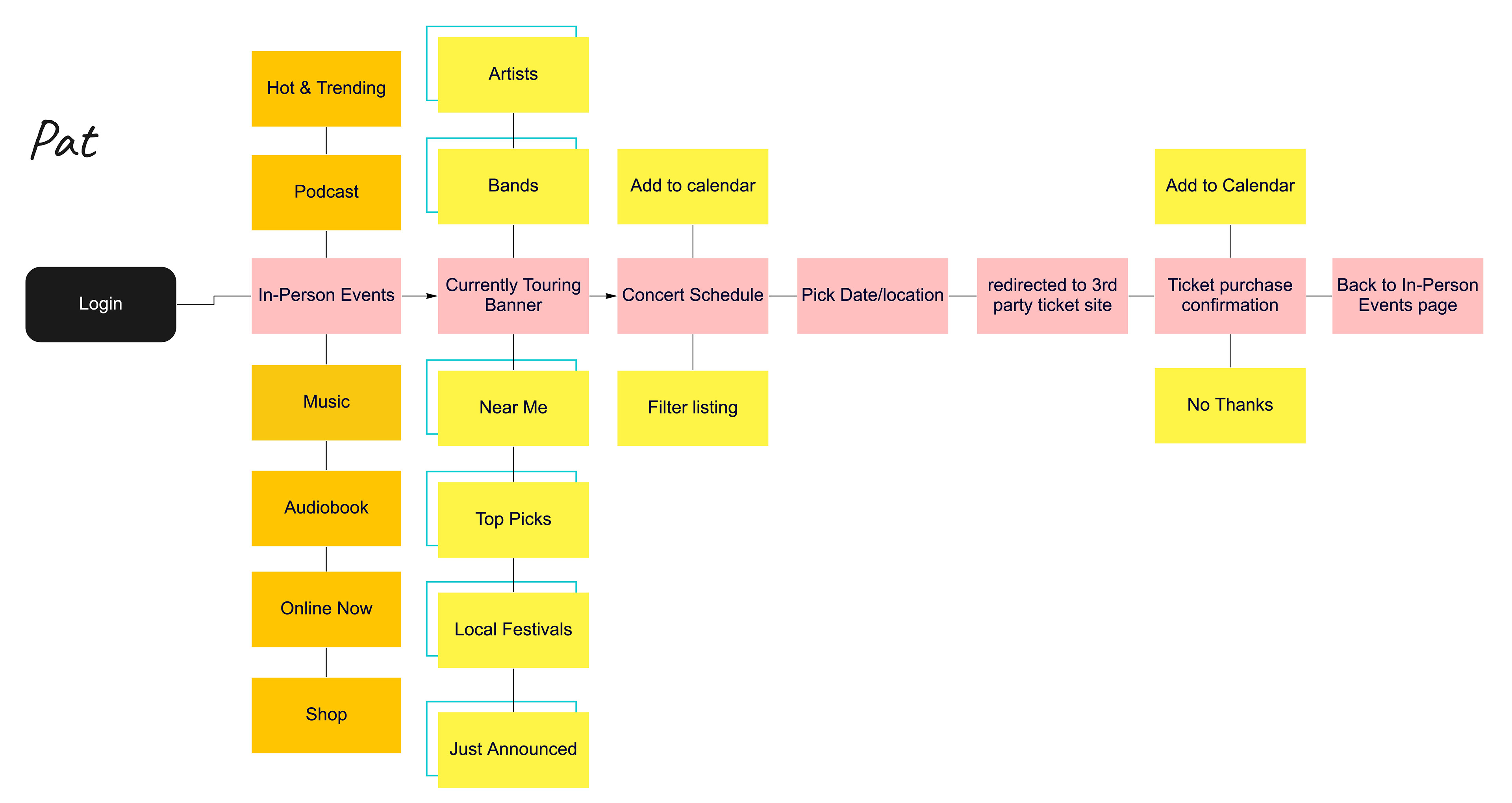
Pat's user flow created in Miro.
A walk through for a user that is interested in concert scheduling and ticketing features in the application.
Mary
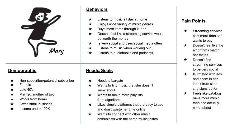
Proto persona Mary has pain points with the lack of control over explicit lyrics.
"I want an option to remove explicit lyrics from my song listings to play them freely around my children."
- Proto persona Mary
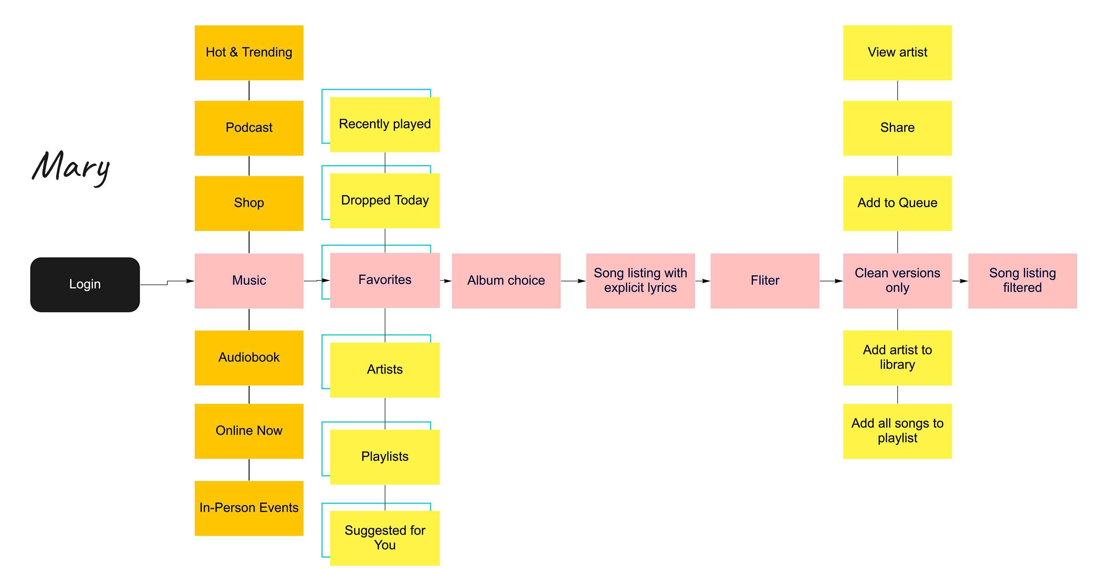
Mary's user flow created in Miro.
A walk through for a user that is listening to music and would like to remove explicit lyrics.
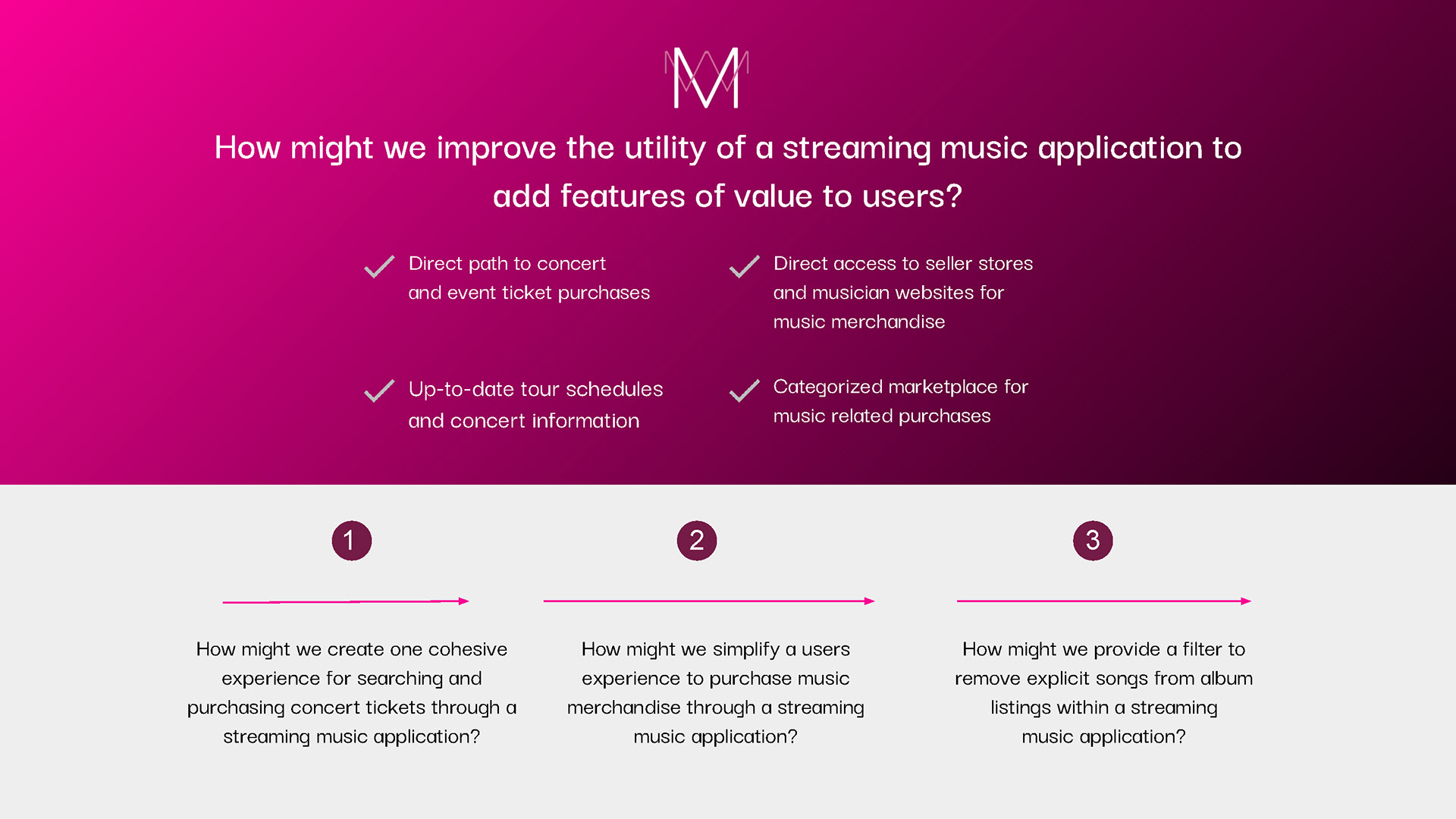
Ideas Researched and Explored:
Direct path to concert and event ticket purchases
Up-to-date tour schedules and concert information
Direct access to vendor stores and musician websites for music merchandise
Categorized marketplace for music related purchases
Explicit lyrics filtering
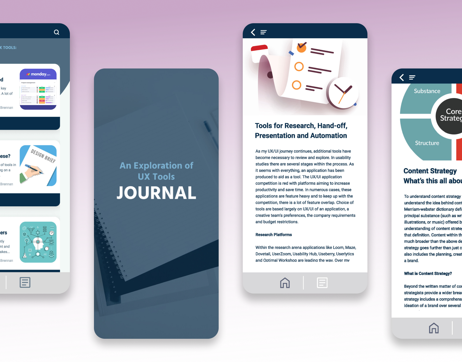
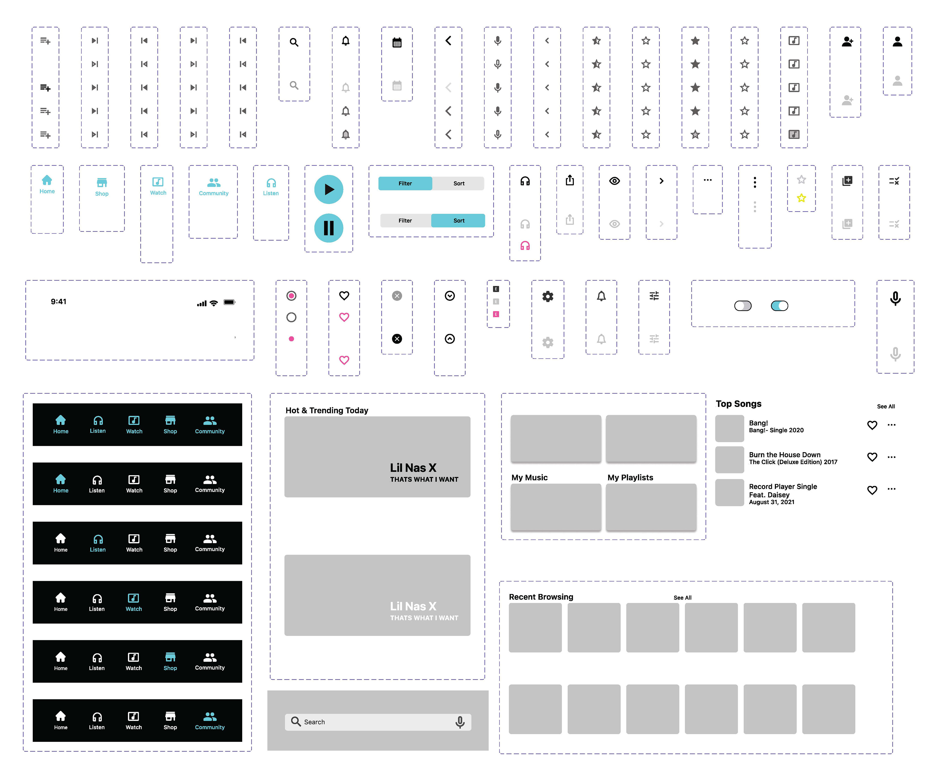
Wireframes
Low-fi wireframes were created based on flowcharts. Ideas began unfolding to test the assumptions.

Wireframes developed for various screens and flows.
Objectives
The goal of testing was to obtain qualitative data on functionality and features within the proposed user flows. User feedback provided insights to iterate the initial design strategies.
3 areas were the focus of usability testing:
1) User interpretation of UI (navigation language and iconography)
2) User interest in additional features
3) User comprehension of the main categories and hierarchy of information
To baseline users we asked a few questions about their general knowledge of streaming music applications, if they currently use an application to stream music and which applications to gauge user experience and familiarity.
Cohort
A screener was sent out to 30 potential users in the target audience. Five users were chosen and performed the usability test over the course of one week. Testing lasted 30 minutes per session. The age range was between 36-65 and user professions also varied.
“If I don’t know what something means I will click on it to figure it out, that’s how you learn about a new app.”
-User Participant 4
Testing Summary
Patterns and trends emerged after the first two sessions:
1) The home screen category terminology created confusion
2) Certain iconography was confusing and did not match mental models
3) A search bar feature was needed
1) The home screen category terminology created confusion
2) Certain iconography was confusing and did not match mental models
3) A search bar feature was needed
Qualitative data collected was informal and with further development most preferences and algorithms would be personalized upon onboarding. Users did not have difficulty completing the tasks requested in the scenarios, however the terminology of categories needed to be addressed.
Feedback was clear that the clarity of the navigation and category hierarchy should be addressed.
Interviewing sessions revealed insights for my personal testing process. After a review of the recordings, leading the user was a recurring error as well as allowing for additional time for testing for a more relaxed organic experience.
“I would assume the navigation icon for watch would be for music videos since
it is a streaming app.”
it is a streaming app.”
- User Participant 2
Recommendations
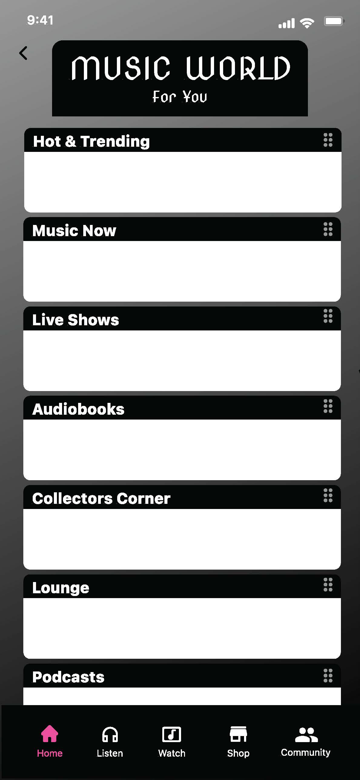
Edit home screen terminology, simplify headers.
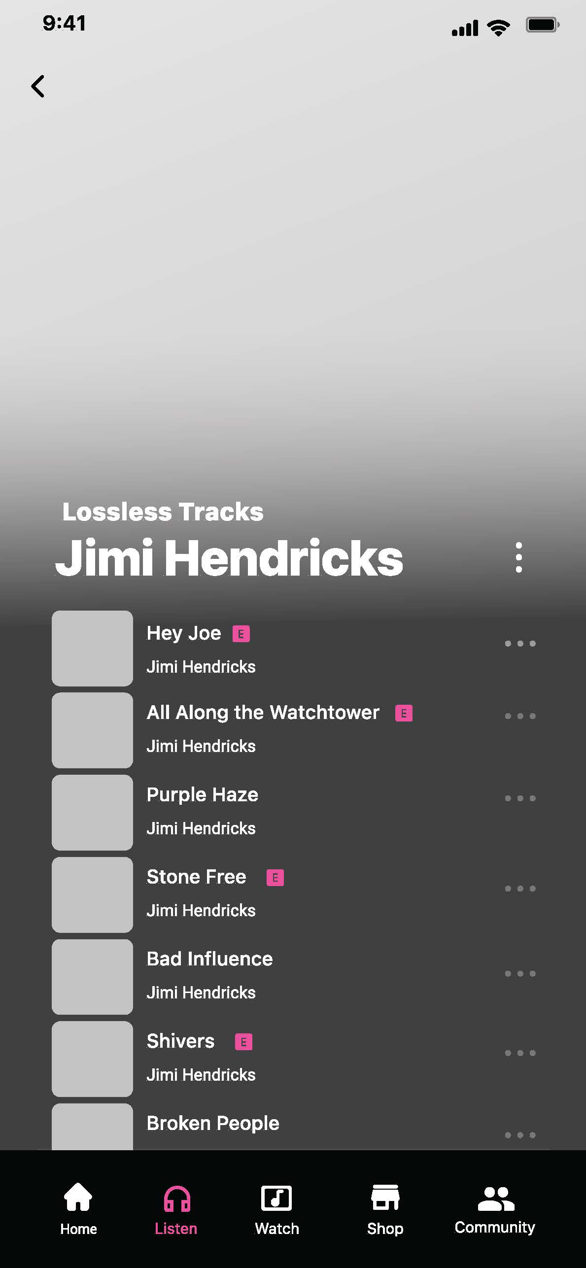
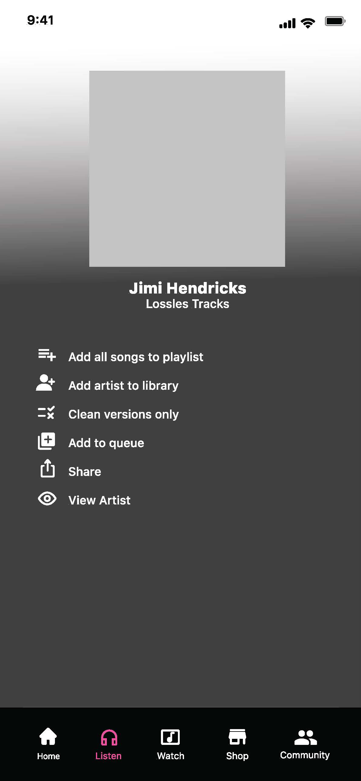
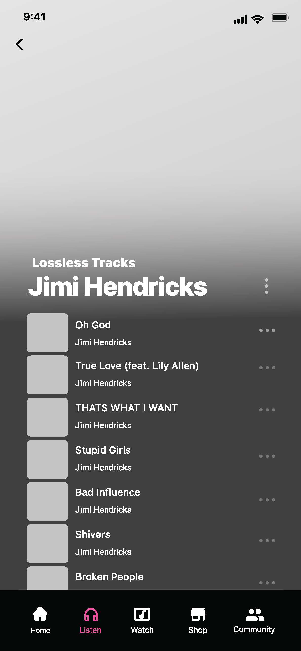
All participants were confused with the term “lossless tracks.”
Research the term “watch” and find alternative options.
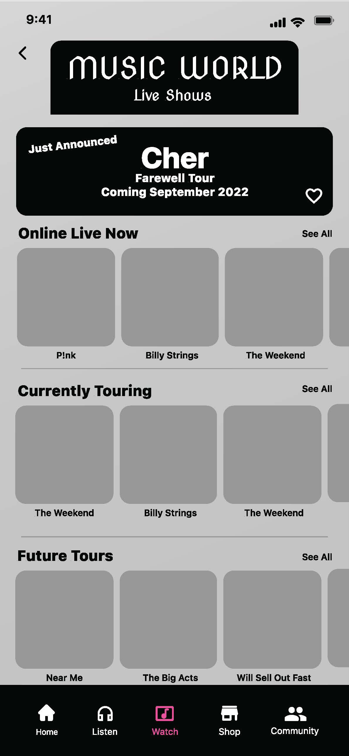
Some users felt live concerts would fall under “community” or “listen” navigation choices.
Add a search bar header. This would eliminate browsing through multiple screens to find specific categories in the catalog system.
Simplify category structure to eliminate additional steps in the process.
Research additional iconography for buttons and navigation bar.
Consider increased accessibility, specifically for text size and dark mode.
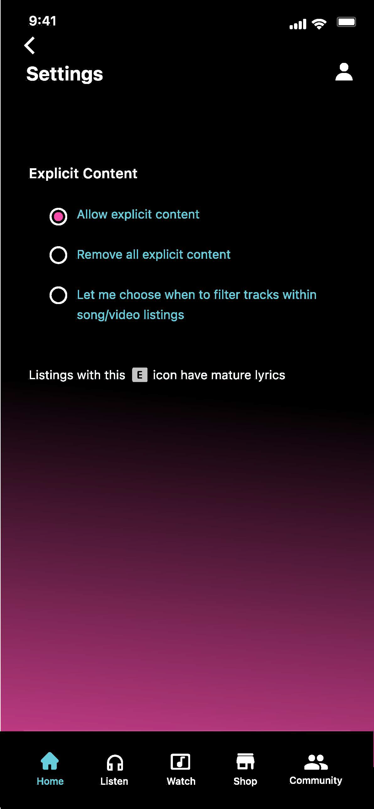
Research a potential setting to globally filter explicit songs/lyrics.
Add X (exit window) button for for user control and freedom.
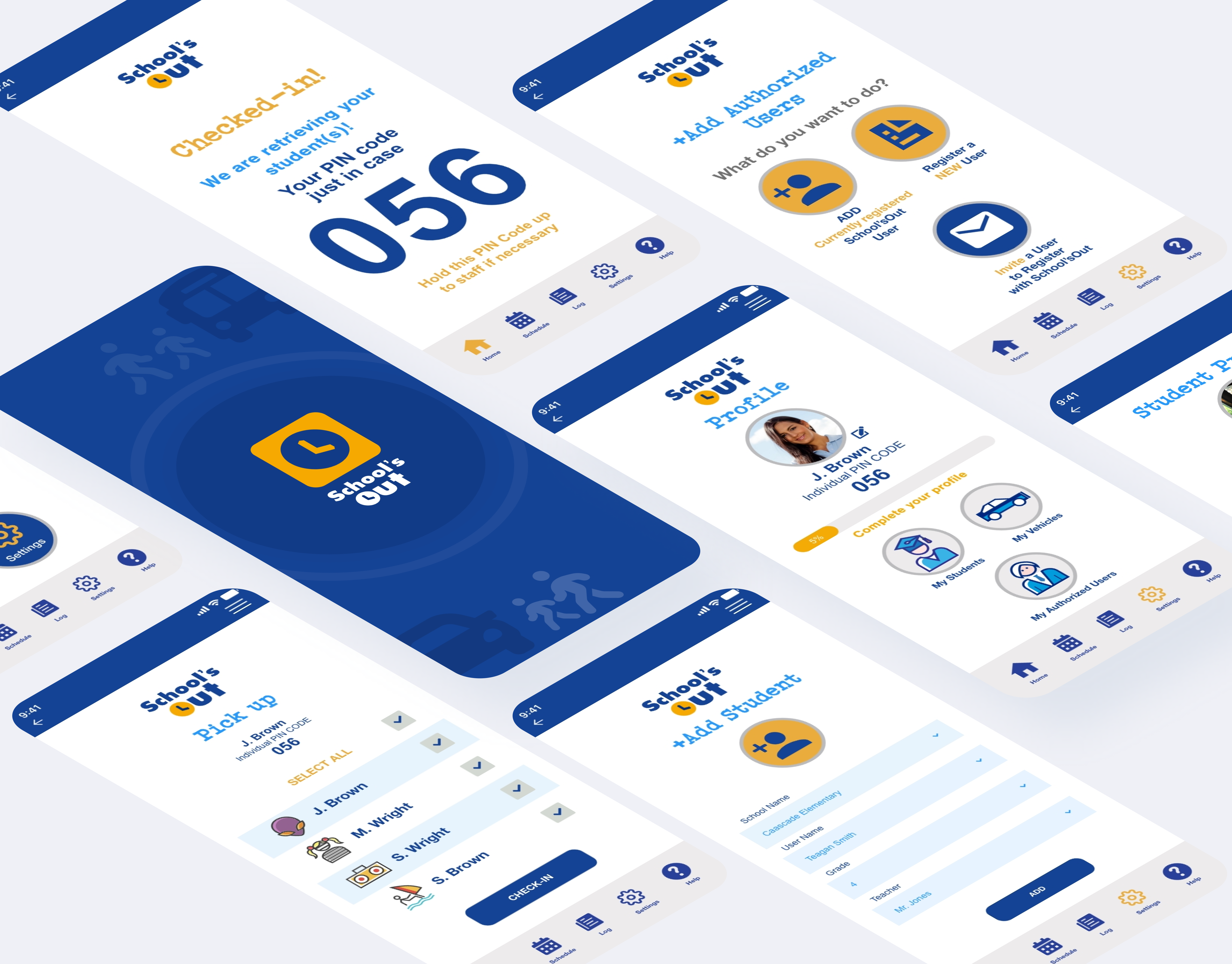
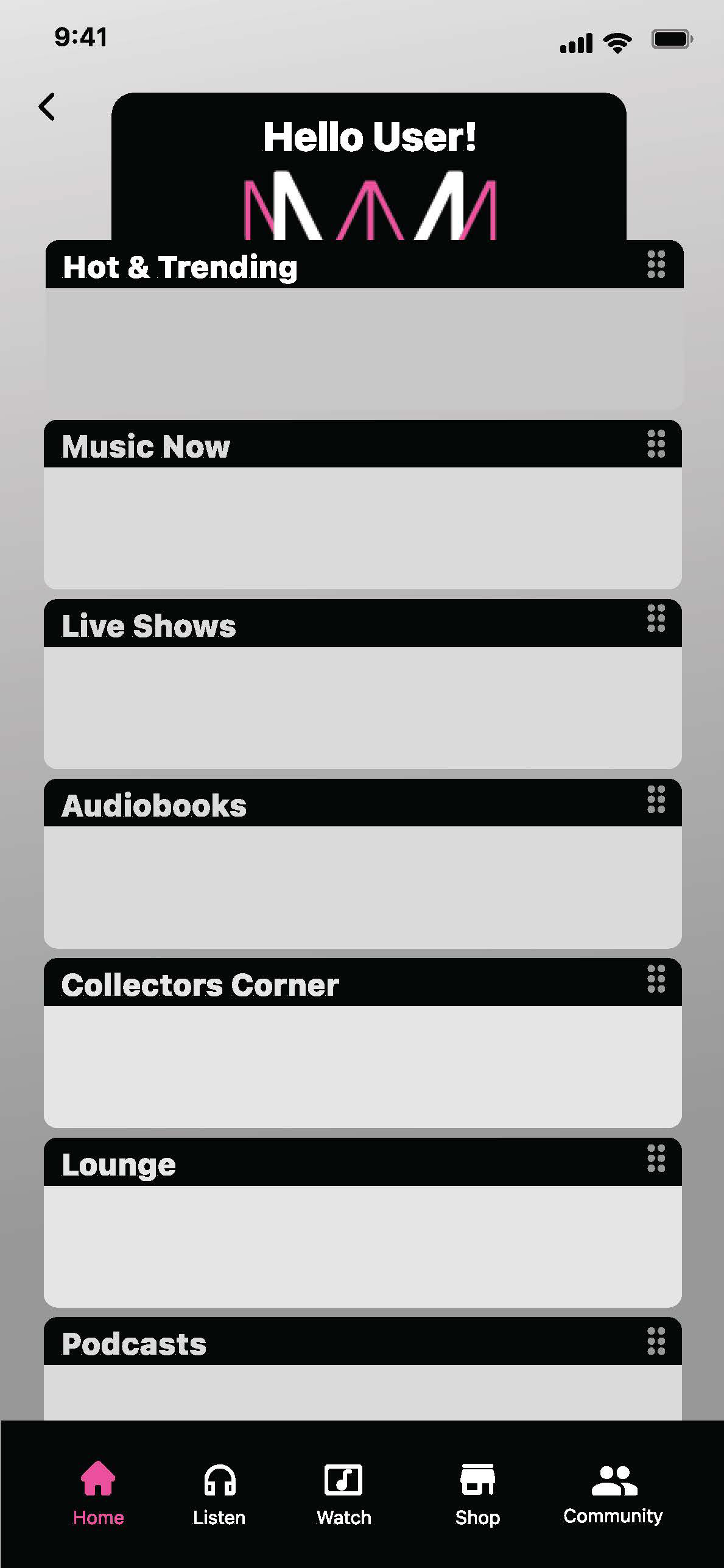
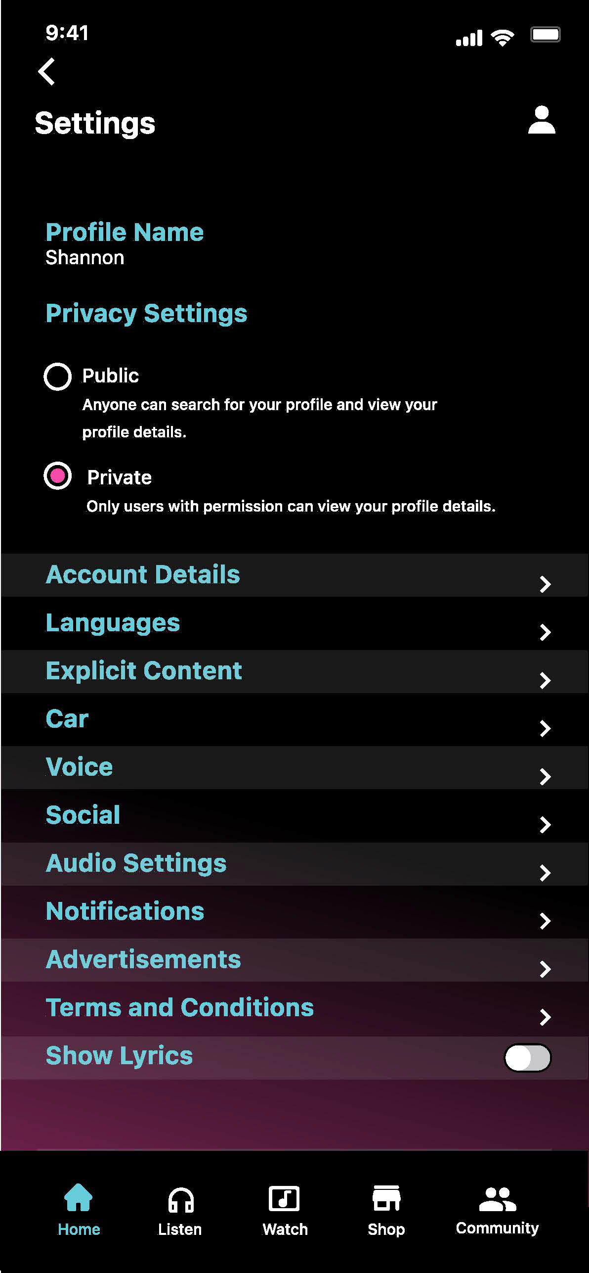
High-fidelity Prototype
Following the first round of testing with five participants, feedback prompted additional areas that needed consideration for modifications. As the structural edits were being addressed, the branding, color palette and design system were concurrently explored and developed.
The market research provided a baseline for ideas, however if this product was to be distinct from the competition, the branding and color palette would need to represent a defined, recognizable, contrasting identity.
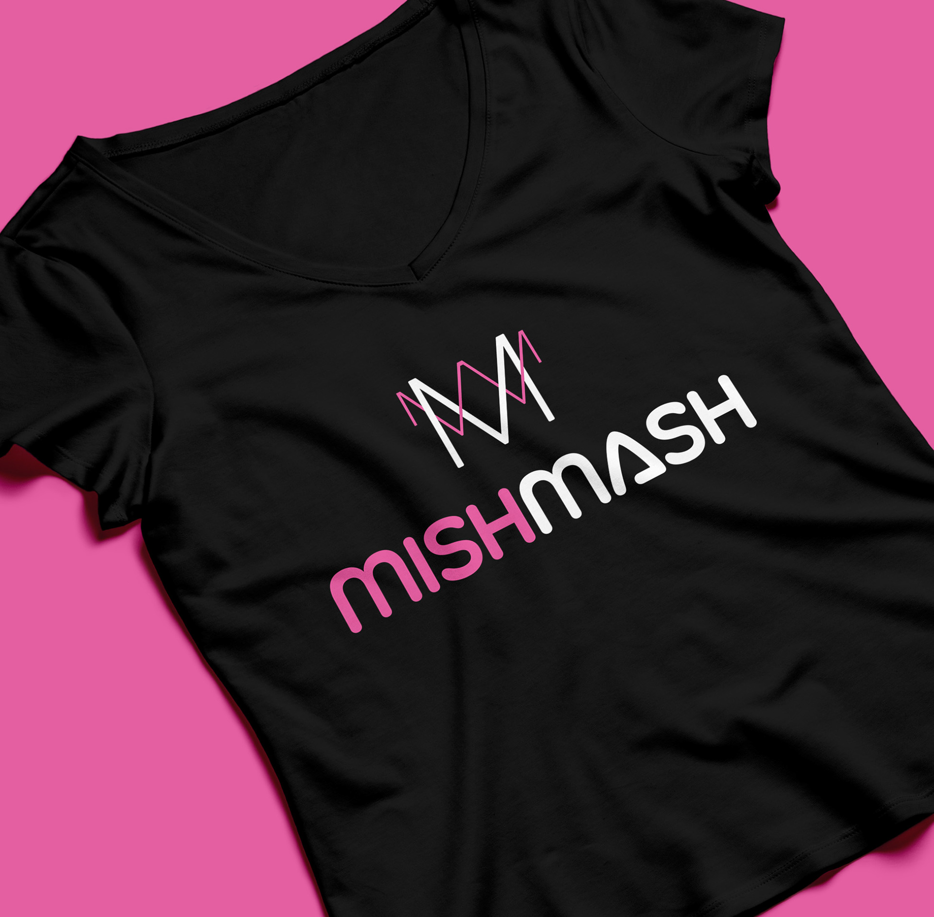
Branding
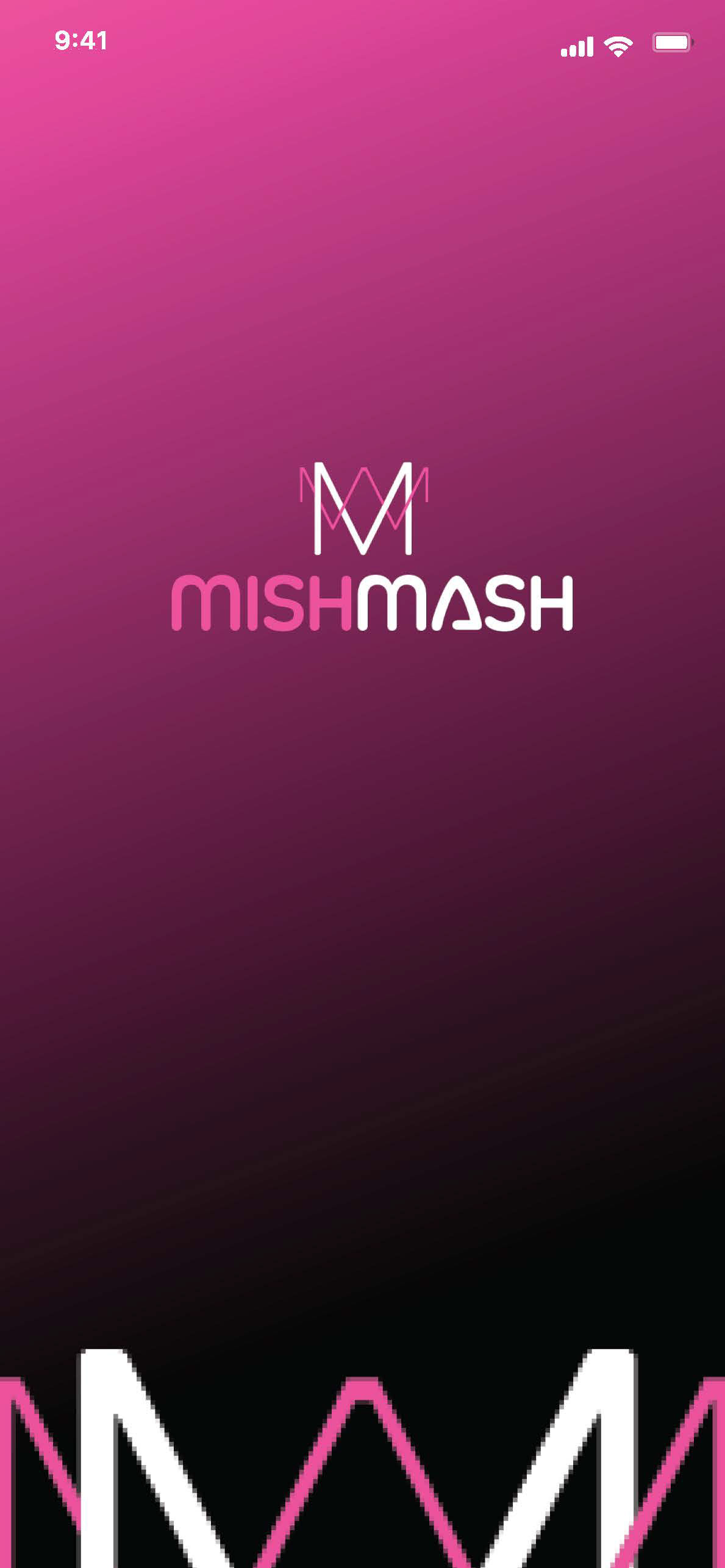
Branding was inspired by the frequencies of sound waves. Colors were incorporated to suggest a vibrant, stylish and hip feel that would not be confused with competitors. The product name Mishmash was brainstormed by methods of word dumps, alternate spellings and synonym exploration. The initial idea stemmed from words that communicated variety, a collective or a hodgepodge for the musical community.
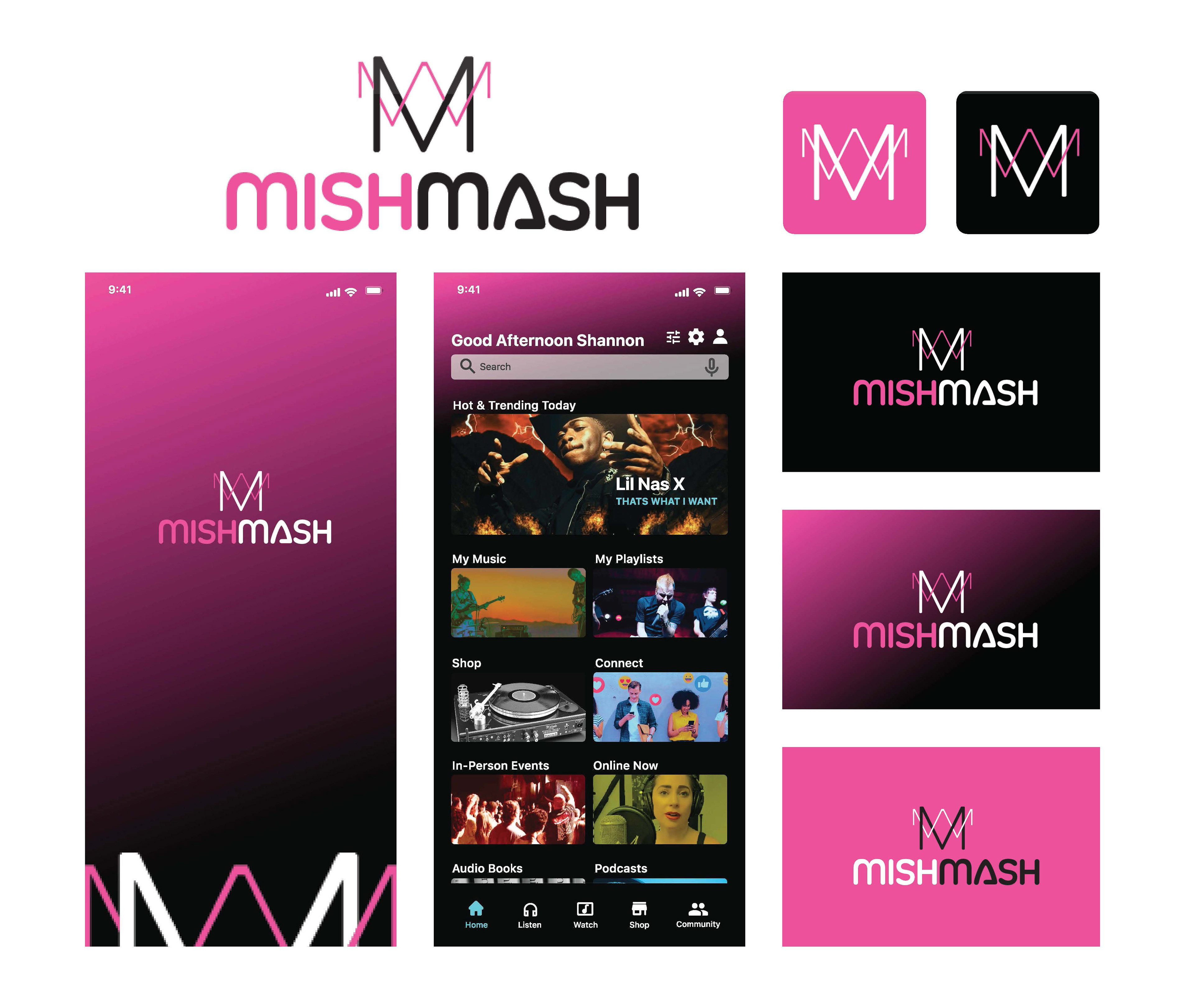
Design System
The design system began to take shape once wireframes began to provide design patterns and templates. The design system was not over developed due to the accelerated timeline. Community UI kits were reviewed and utilized to maintain industry standards and platform conventions.
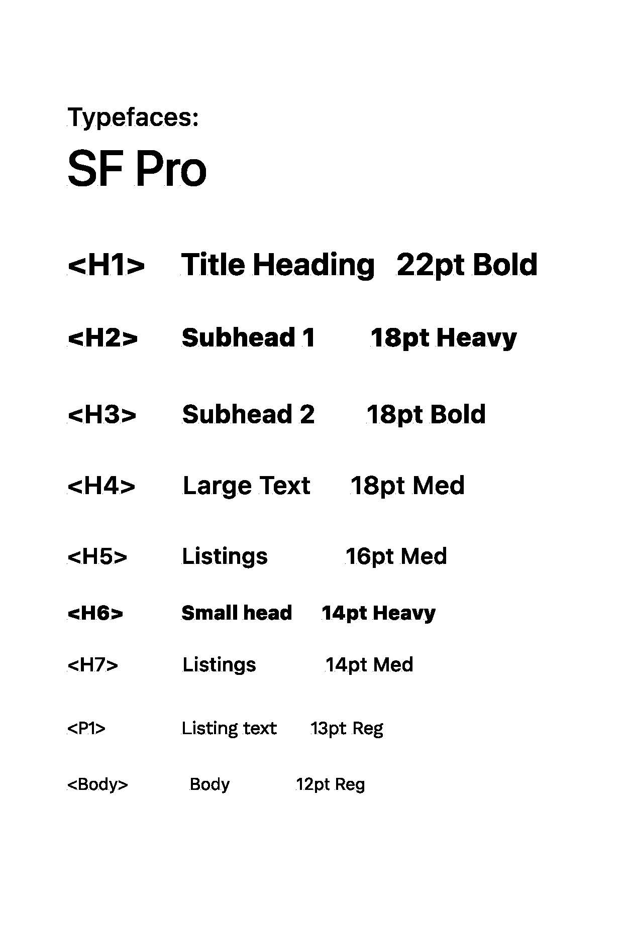
Typeface is reliable and clear to read. Sans serif was chosen for headers and a serif was chosen for body text. Color palette aimed for stylish and hip and accessibility was regarded for inclusion of all users.

Prototype
Development was handled in Figma. The design system expedited the process. Additional micro interactions were included to increase the satisfaction and desirability of the experience. The main objectives for the prototype were to create a cohesive, valuable, desirable and personalized experience.
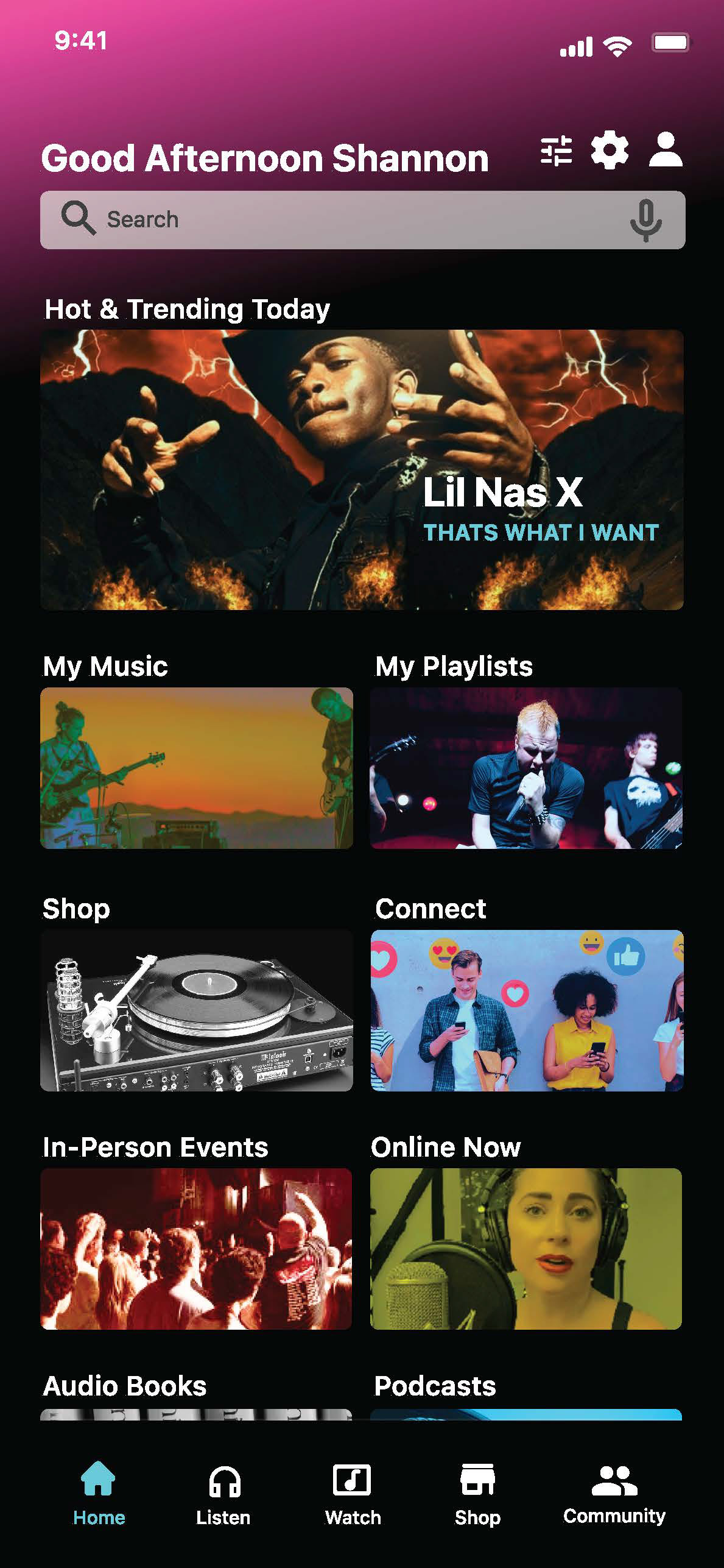
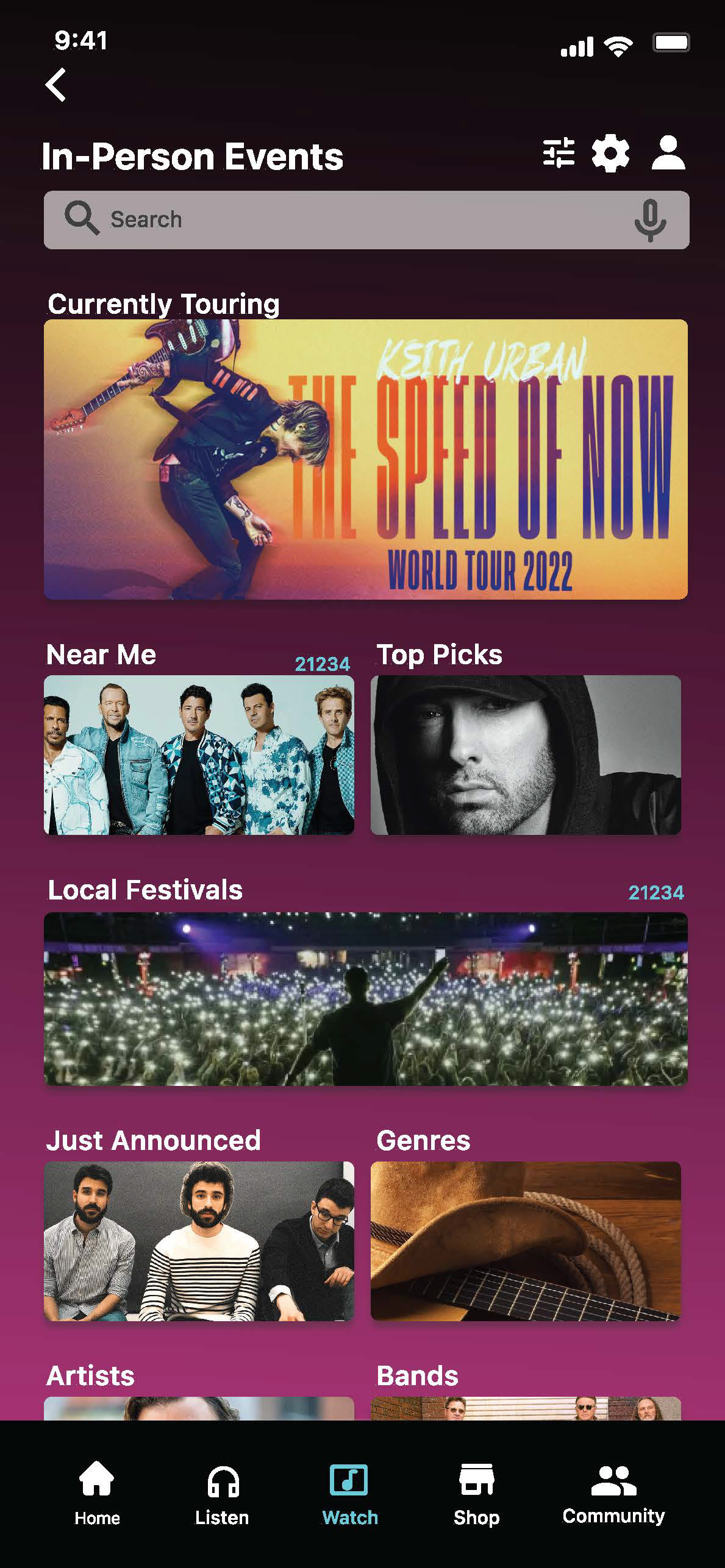
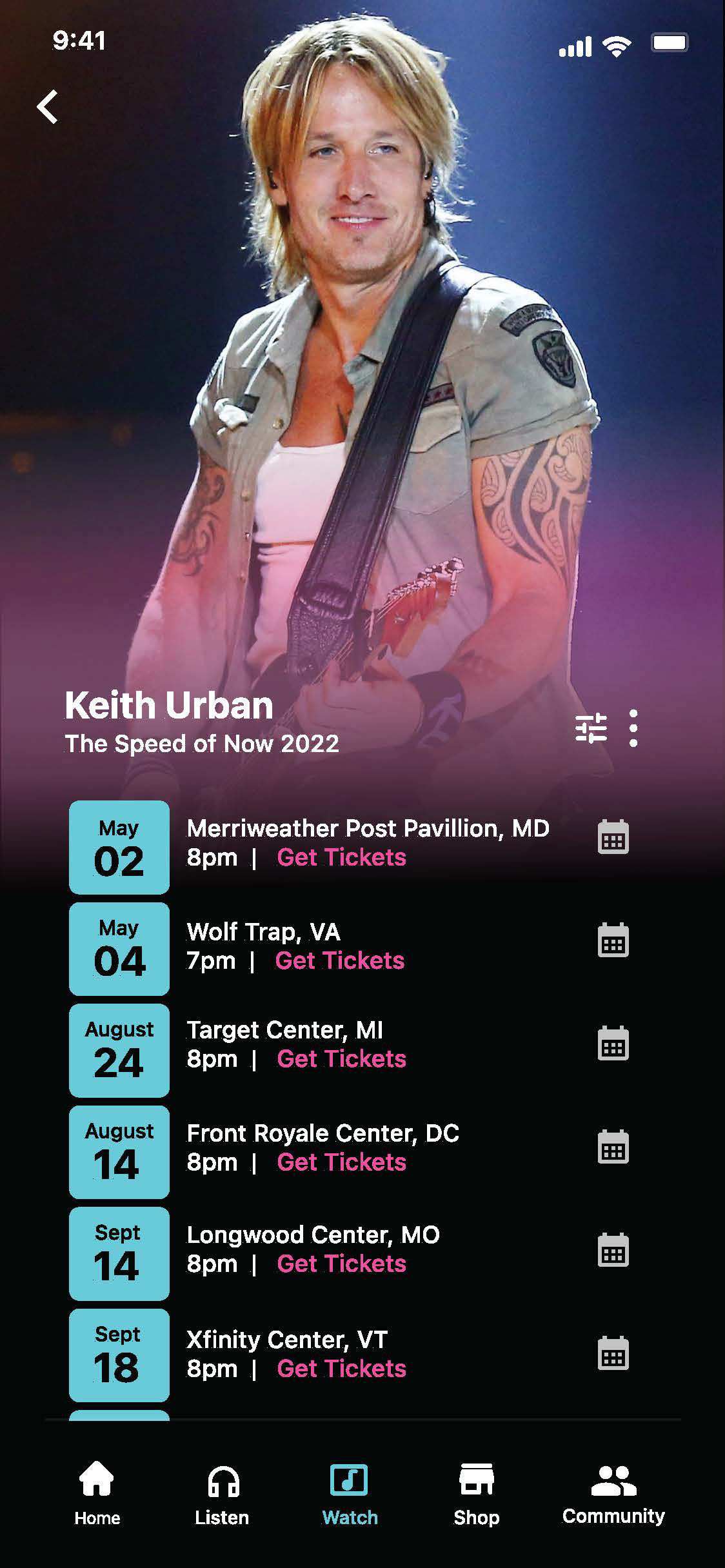
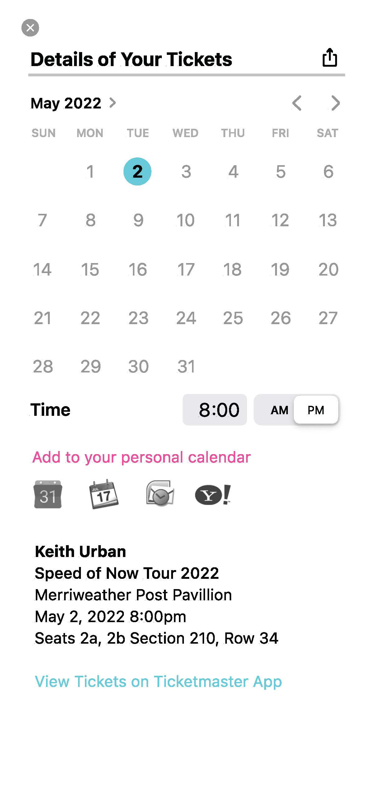
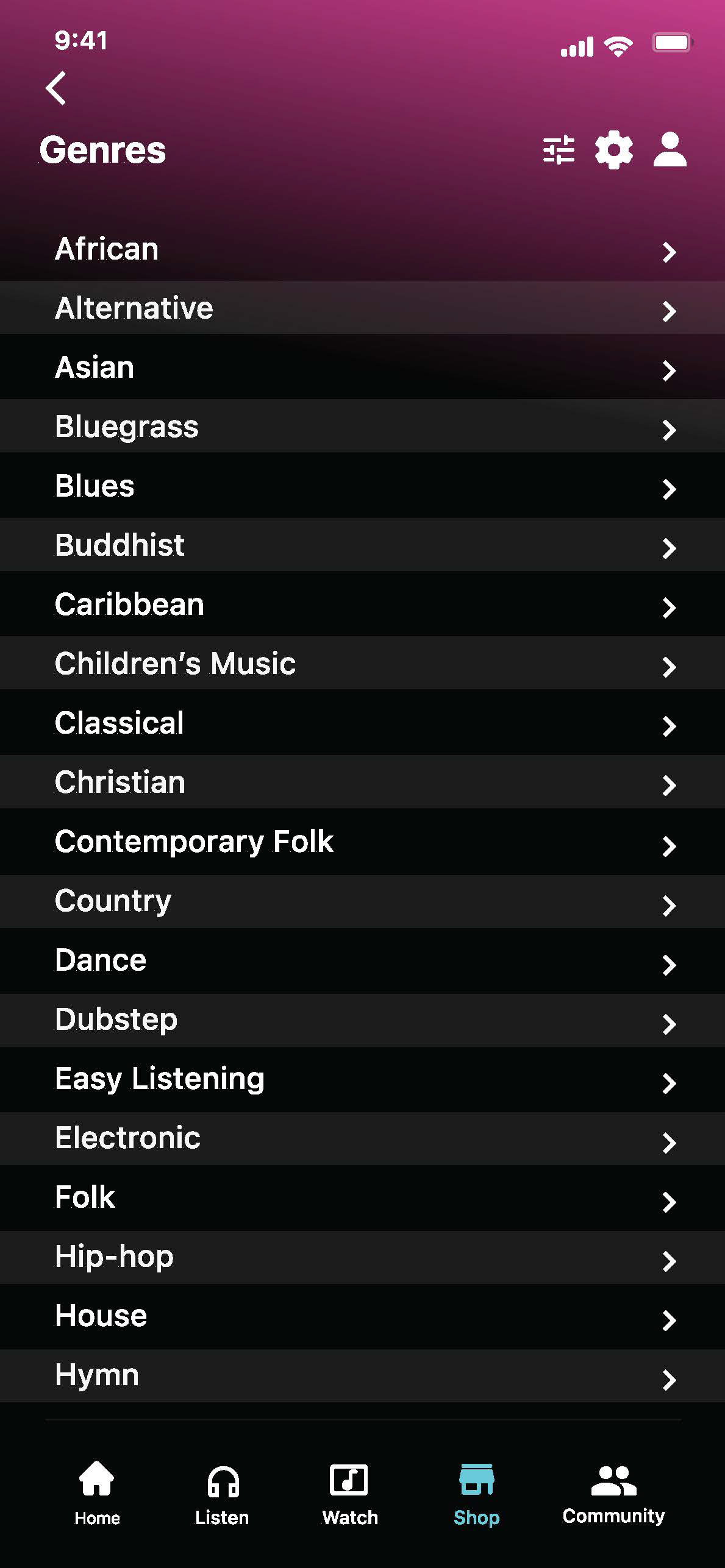
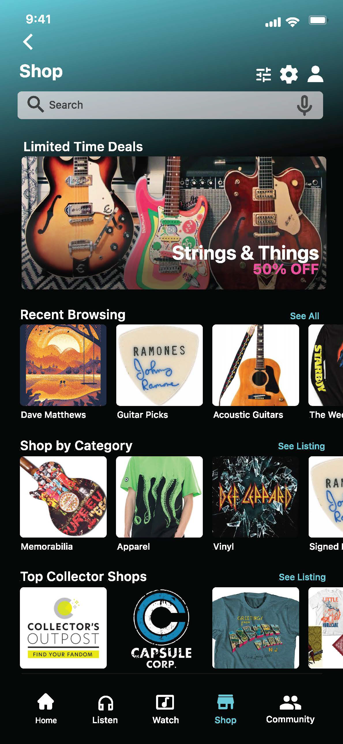
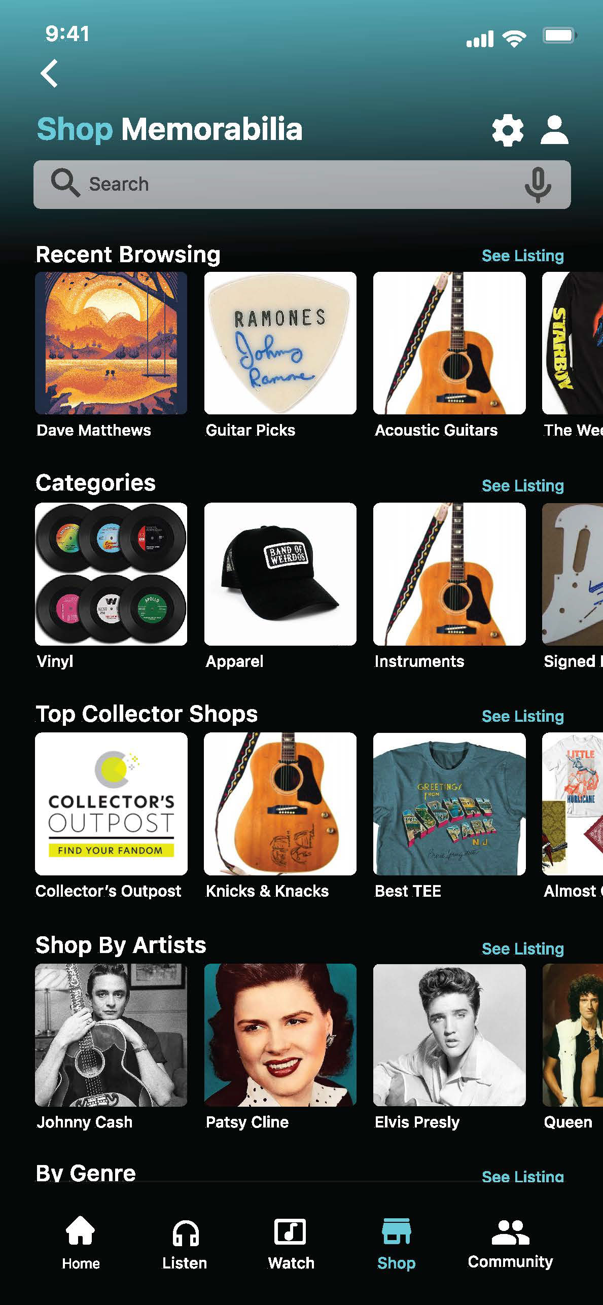
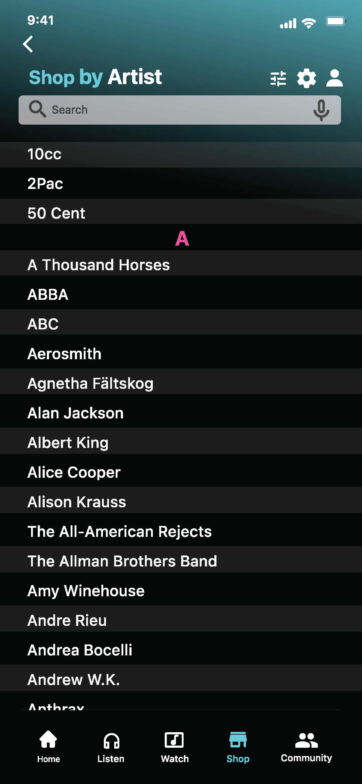
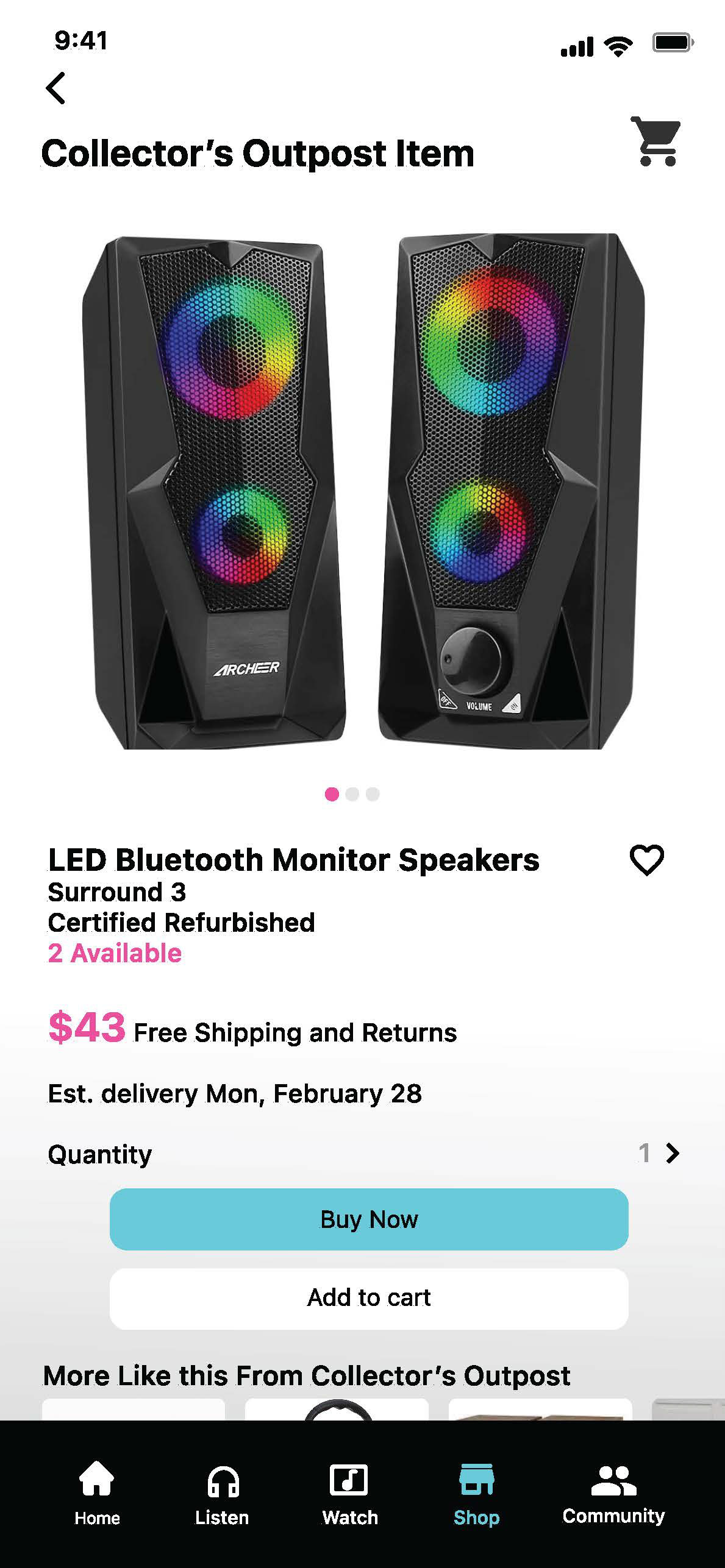

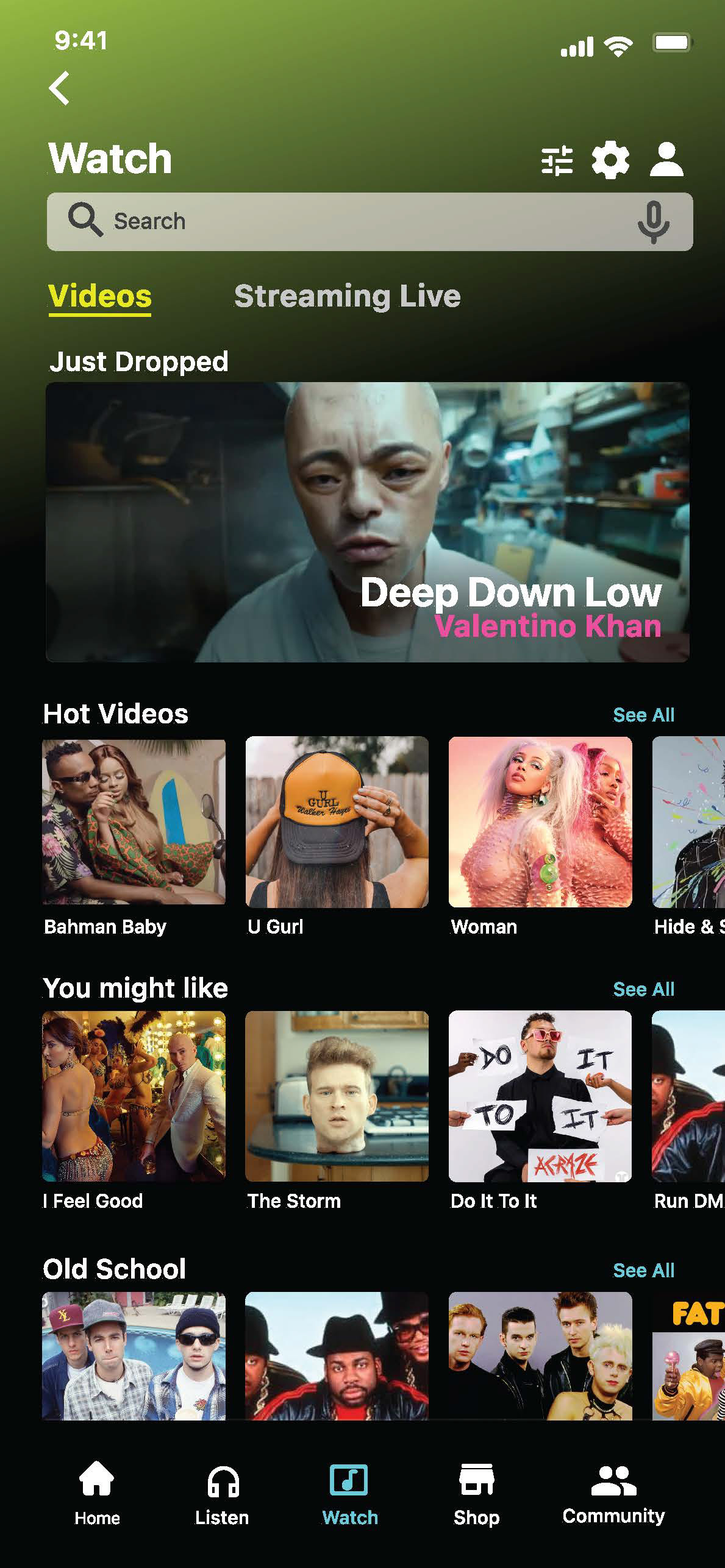
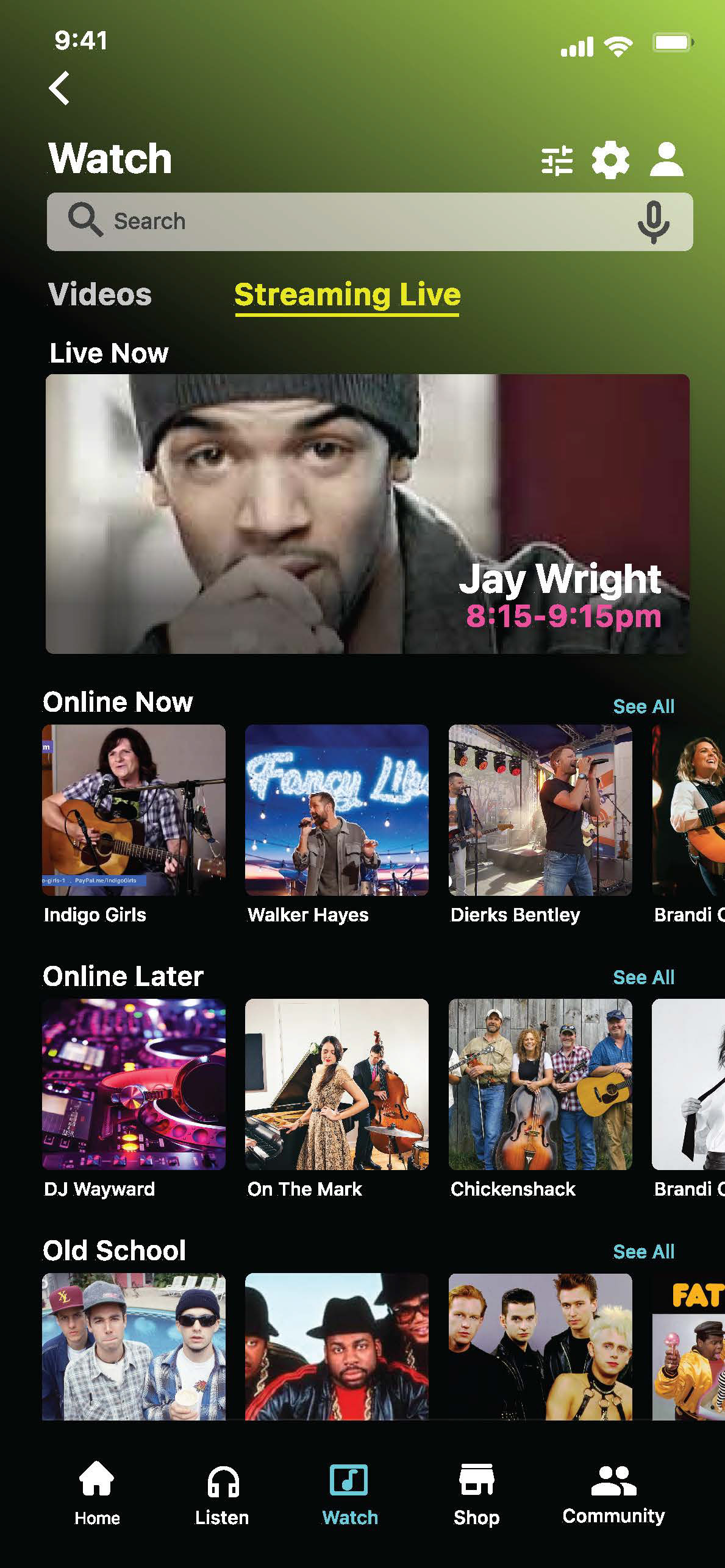
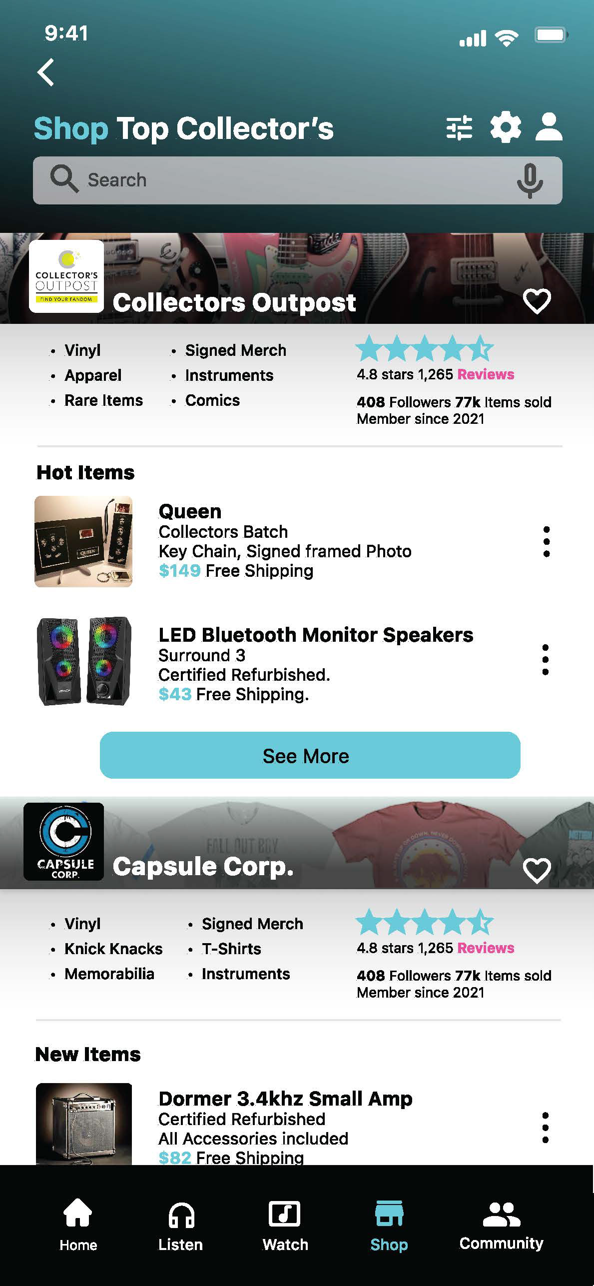
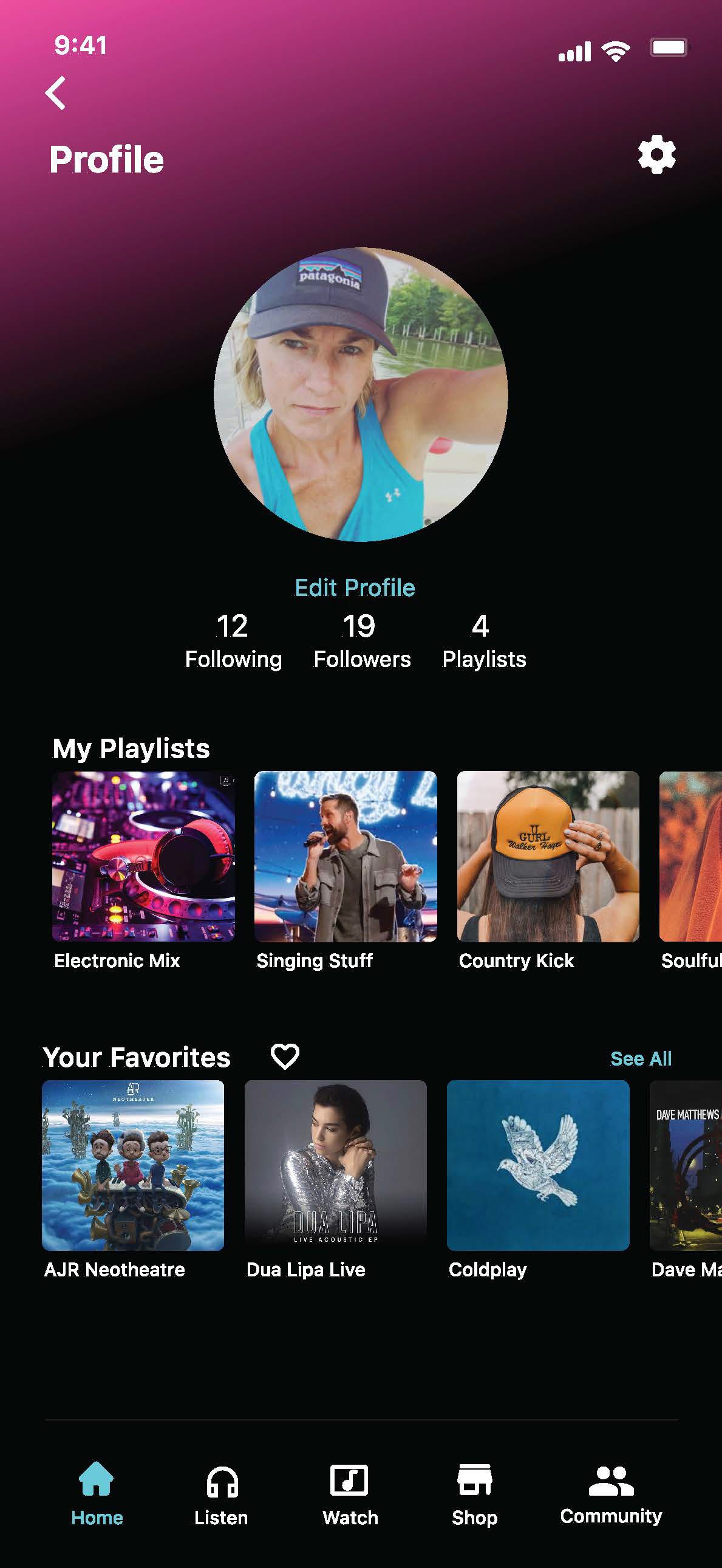
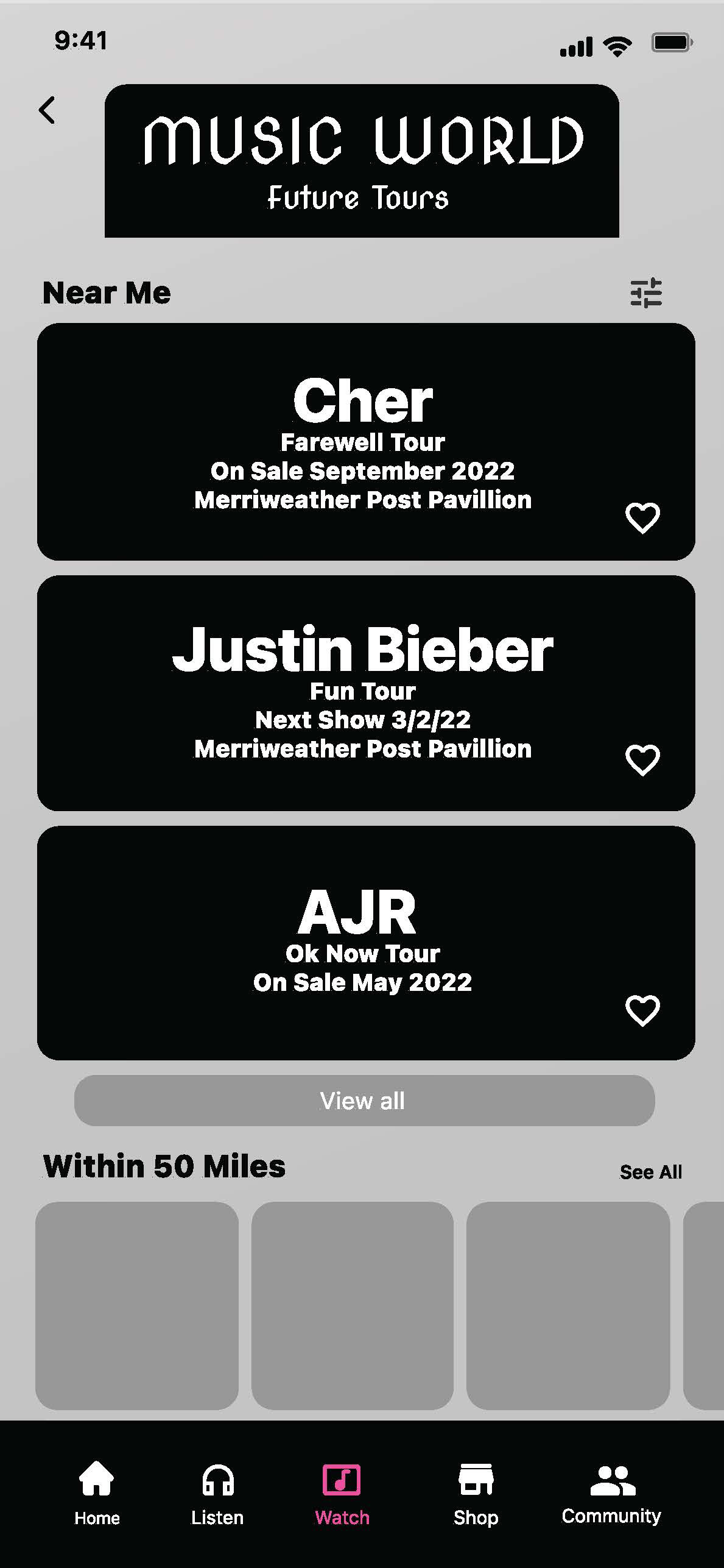
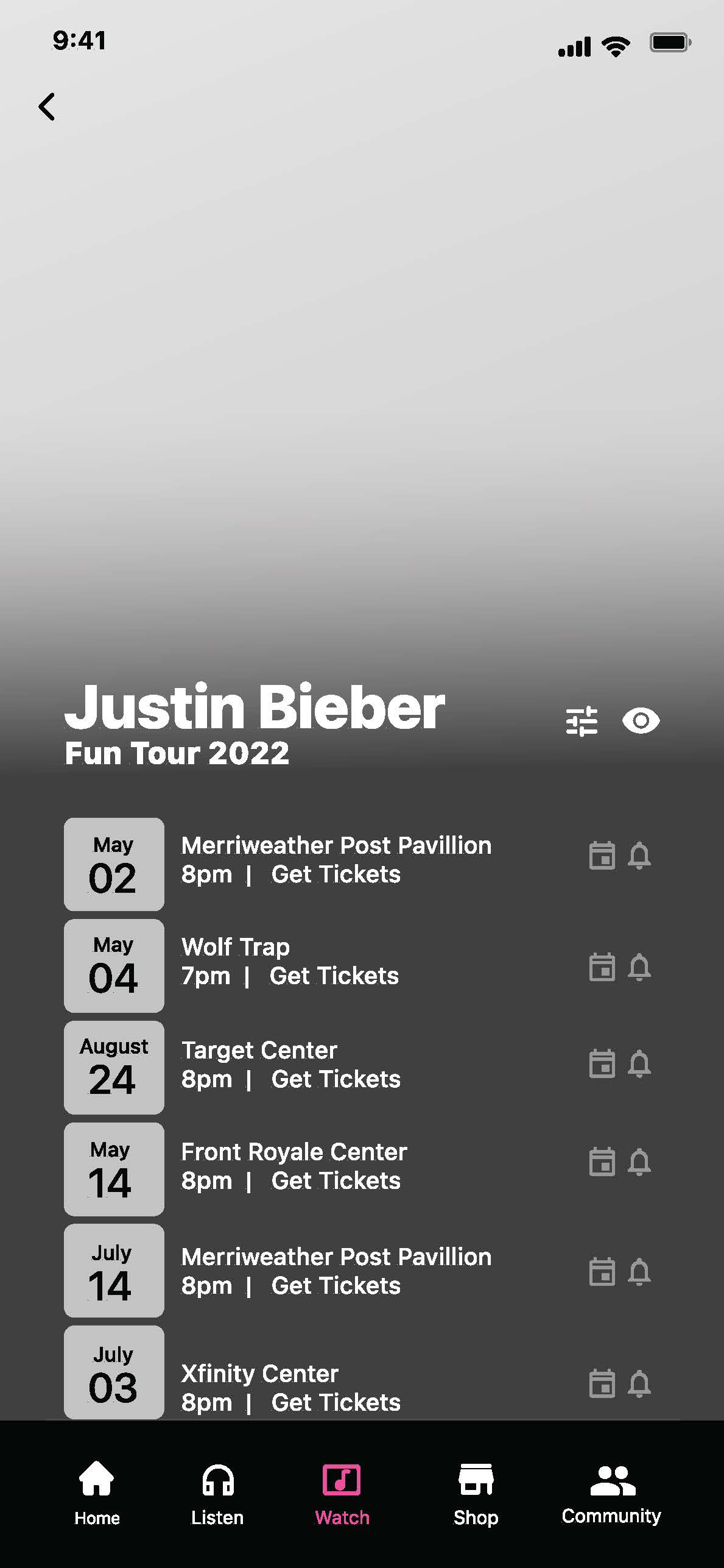
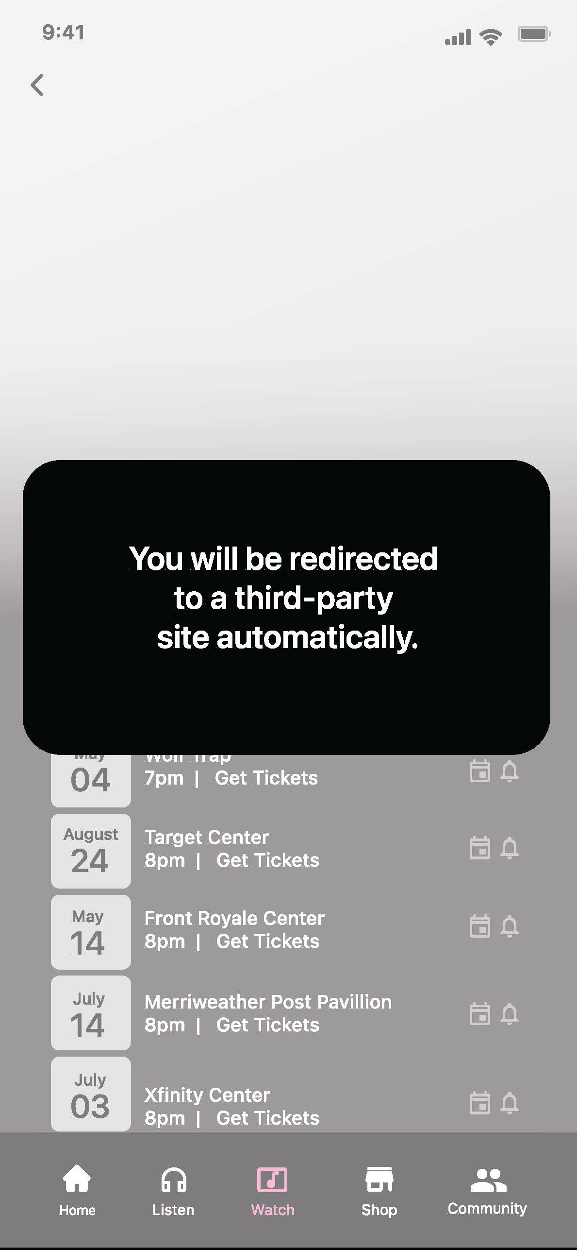
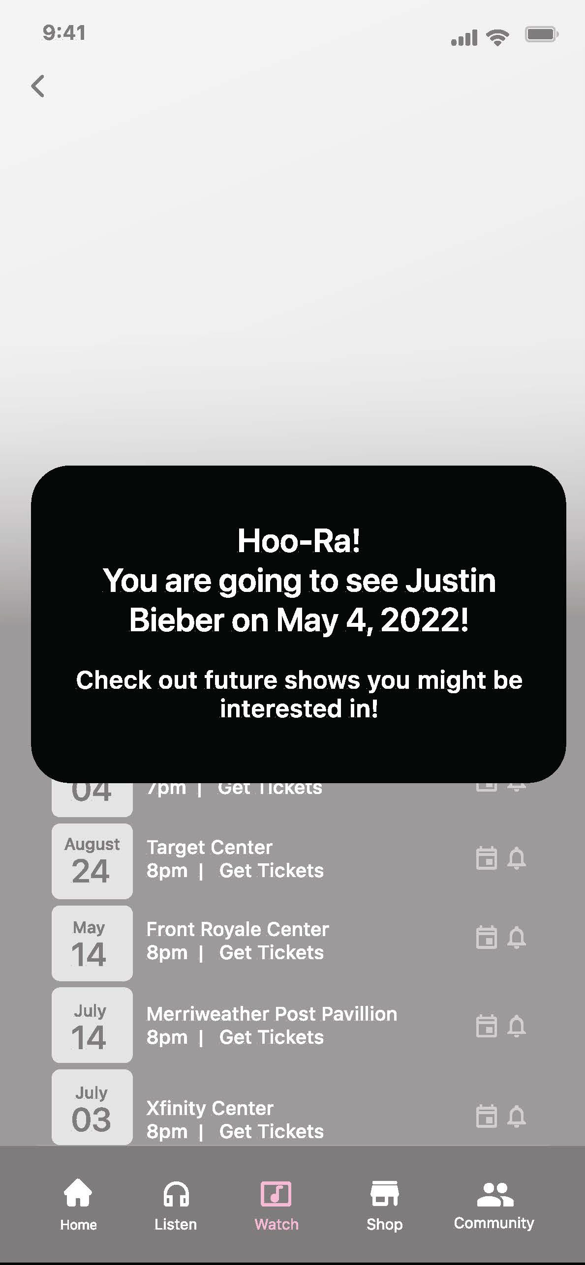
High fidelity prototype screen designs for various user flows and features.
Round 2 Testing
An additional five participants were recruited and given the three tasks for the iterated prototype. Testing lasted around 40 minutes and was conducted via Zoom. User feedback clarified that the expanded experience had improved overall and was well received showing reduced confusion on icons and terminology. 4/5 users rated the experience 5 stars and commented that additional features would provide convenience and increase the likelihood for a return to this application vs. other popular music streaming applications.
“It would be such a convenience to have concert information within the same app the music is streaming. If I really like a new artist, I want to find out more about them-- especially if they are touring.”
- User Participant 6
Next Steps
Additional rounds of user testing and continued research
Provide onboarding to personalize the experience and preferences
Additional competitive research on commerce features to build brand trust by simplifying the experience
Iterate and test to further improve user experience
My Role and Contribution:
• UI/UX Design
• Research/Strategy
• Branding
• Content
• User Testing
• Presentation
Contribution percentage 100%
• Research/Strategy
• Branding
• Content
• User Testing
• Presentation
Contribution percentage 100%
Project Challenges
• Accelerated Curriculum (8-week timeline)
• Learning additional features of Figma
• UX team of ONE
*A proposed prototype concept following the guidelines for a UX Design Prototyping graduate course.
This study was not for profit. Images were used for education draft purposes only.
This study was not for profit. Images were used for education draft purposes only.
Like what you see?
Reach out. We have lots to talk about.
Reach out. We have lots to talk about.